Featured Quizzes
User Quizzes
Create Quiz
Data and Charts
Badges and Games
About JetPunk
JetPunk Shop
Dark Mode
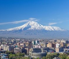
Major Cities Closest to Mount Ararat on the Map
Can you name the cities with a population greater than one million, which lie within 750 kilometres of Mount Ararat?
Including one suburb
The white dot in the centre represents Mount Ararat
Rate:
Last updated: February 22, 2021
You have not attempted this quiz yet.
More quiz info >>
| First submitted | October 16, 2019 |
| Times taken | 460 |
| Average score | 66.7% |
| Rating | 4.75 | Report this quiz | Report |
3:45
Enter city here
0
/ 12 guessed
Time Used
00:00
Best Time
00:00
The quiz is paused. You have remaining.
Scoring
You scored / = %
This beats or equals
% of test takers
also scored 100%
The average score is
Your high score is
Your fastest time is
Keep scrolling down for answers and more stats ...
| |
|
New and Popular
Save Your Progress
Copyright H Brothers Inc, 2008–2024
Contact Us | Go To Top | View Mobile Site
This quiz great!