Featured Quizzes
User Quizzes
Create Quiz
Data and Charts
Badges and Games
About JetPunk
JetPunk Shop
Random Quiz
Dark Mode
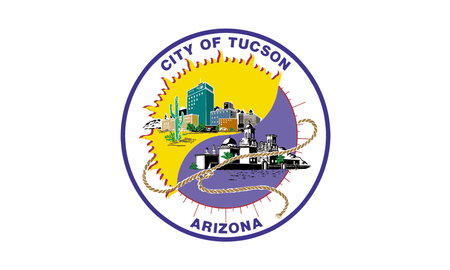
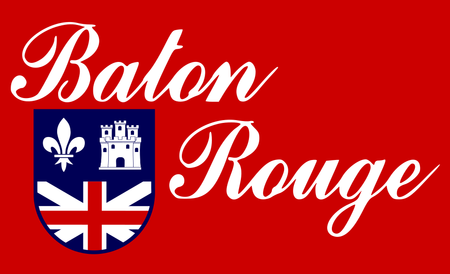
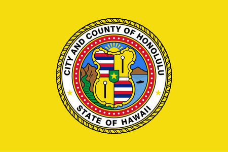
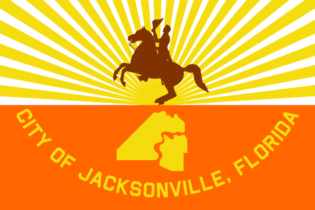
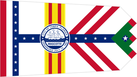
Problematic US City Flags
Here we have some examples of US City Flags that are just... bad. Whether due to over-complication, too much text (or text that's just too much? Looking at you Baton Rouge), or creating "SoB" (Seal on Bedsheet) flags, these cities deserve better.
Yes, I know that most of them have the city name in the picture. This is intentional public shaming.
Rate:
Last updated: March 8, 2021
You have not attempted this quiz yet.
More quiz info >>
| First submitted | March 8, 2021 |
| Times taken | 81 |
| Average score | 83.3% | Report this quiz | Report |
4:00
Enter answer here
0
/ 12 guessed
Time Used
00:00
Best Time
00:00
The quiz is paused. You have remaining.
Scoring
You scored / = %
This beats or equals
% of test takers
also scored 100%
The average score is
Your high score is
Your fastest time is
Keep scrolling down for answers and more stats ...

New and Popular
Save Your Progress
Copyright H Brothers Inc, 2008–2024
Contact Us | Go To Top | View Desktop Site
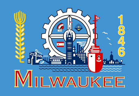
Milwaukee just plain-out sucks.
I don't know if you've seen this TED Talk, but if you haven't, you definitely should!
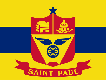
Other flags on here have similar high notes--Tampa choosing a non-rectangular shape, San Fran's phoenix icon, St Paul's simplicity--but in the end, they could use a little help. A friend showed me that TED talk right after I published these quizzes for the first time. I learned the Ted Kaye quote I referenced above after hearing Roman Mars quote it in this talk.
https://www.ted.com/talks/roman_mars_why_city_flags_may_be_the_worst_designed_thing_you_ve_never_noticed?language=en
Here's the old one: https://www.byui.edu/radio/pocatello-has-the-worst-flag-in-america
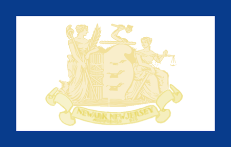
The escutcheon is fascinating, with a fleur de lis of France, the Castile of Spain, and the Victorian era (pre-northern-Ireland-red-diagonals) flag of Great Britain.