Argentinian Province Flags Ranked from Best to Worst
Last updated: Monday December 6th, 2021
Report this blog
Hermanos! Argentina is an amazing country, fruit of a healthy rivalry, and a good friendship with Brazil. I love Argentina in many points, except for soccer, (but don’t worry if you shout for River Plate — my second team — or Lionel Messi — just the best player in actuality, but while that Messi is better than Neymar, Pelé is better than Maradona 🤔) lol. I plan to do more ranks. Hopefully with them, my creative block will run away to Botswana or Guam lol. So let’s start!
1st - Chubut
We start with Chubut. It’s just the best flag of the Argentinian provinces. The only thing strange for me is the 0 symmetry between the lines (such as curvatures and position). But it can’t change the first place on the list. Riveting.
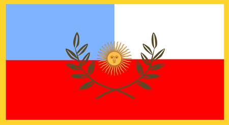
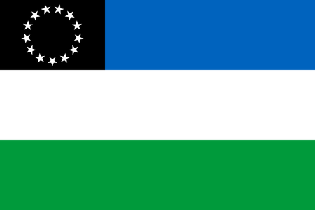
2nd - Santa Cruz
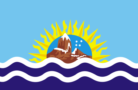
I like it because of the waves of the sea, and the shadows are really well done. That said is quite curious these mountains (representing Patagonia) fluctuating on the sea ;-; Still safely in a good position
3th - Córdoba
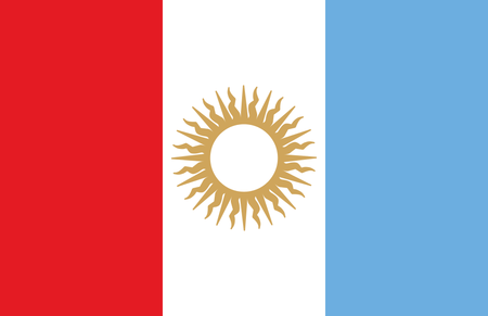
It’s a good flag. I quite like this design. Some sources included a change of colors. They are now darker, and terrible.
4th - Tucumán

It’s super simple. But it’s really smooth, although they just removed that depressive sun of Argentina flag, and inverted the colors 🤔
5th - Tierra del Fuego

Good, but who warped that line? What is going on here? It was good until the moment they asked for a 3-year old baby draw a diagonal line
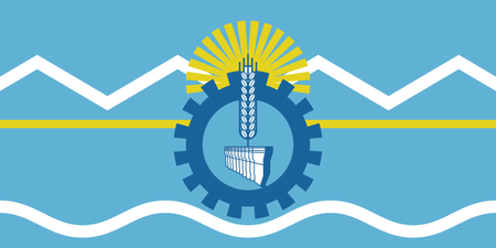
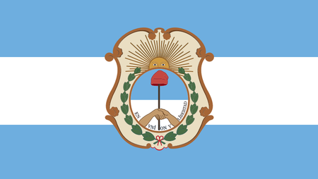
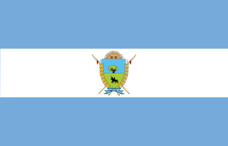
6th - Buenos Aires
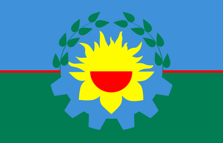
It’s loaded of information when you see distantly. But it’s not like the freaking Veneto flag... and it’s cool for me, but someone forgot to add the eyes of that sun (looks a mouth smiling), inside of a half gear and half plant? Ok, now that’s strange.
7th - Entre Ríos
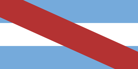
It’s nice for me and simple... but somehow they putted a huge red line in front of the flag, that sometimes get strange. Think on this flag 3D. Are you passing a bow on a package?
8th - La Rioja
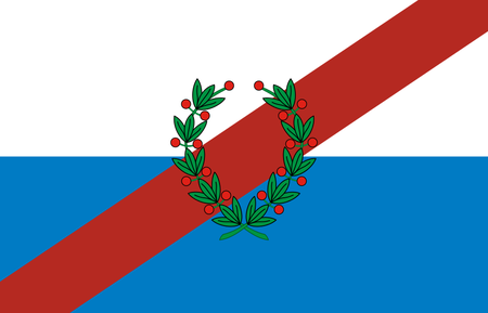
And now it’s another package, but the bow is now inverted, and fortunately, the sender could remind of put a stamp to send to the mailman. Entre Ríos must be having difficulties until now to send its package. Although that, can be happy for have a more appealing one.
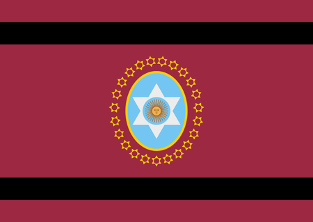
9th - Santiago del Estero
Type of flag you won’t put as thumbnail for your quizzes or blogs. But it’s... cool?
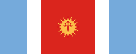
10th - Santa Fe
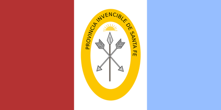
So “invencible” too the point for lose for other 9 provinces.
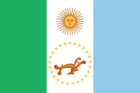
11th - Misiones

Russia in a 180° spin. Just that.
12th - Catamarca
The flag has already a unnecessary border, but I’m too boring at the point to add another one. Congrats on imitating Chile on a... peculiar way.
13th - San Juan
Youngest of the list (2018). The coat of arms is nice, but not creative, like (basically) all of the flags.
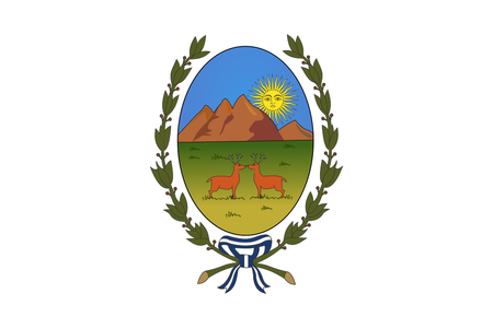
14th - Mendoza
Tip for your thumbnails. Maaaaaaybe for your drawings
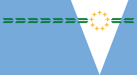
15th - Chaco
Who will plow this land?
16th - Corrientes
That triangle of Middle East dreams... breaking our expectations... uh... and congrats to the text, overpassing the limits. The limits of the white color that it should still be exclusively there.
17th - Río Negro
This is for you understand to never put black and green on a flag.
18th - Neuquén
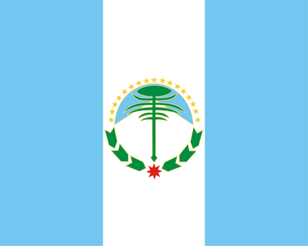
Who drew this flag? Is it Paint or... These little children drawing flags is giving me some dizziness... why didn’t they contracted Aficionado? Or maybe Thread could do a new contest for it.
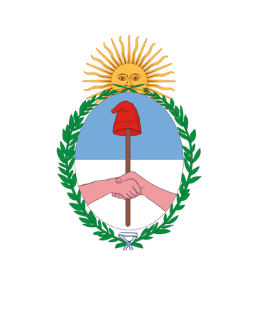
19th - La Pampa
And now, a wave of Argentina flags with a coat of arms, and USA influence. I need to see minimum and stupid details of the coat of arms. It looks like that the depressive sun of Argentina want revenge. Shield, swords, and even a knight on the vast Pampas. Don’t do this at home, children!
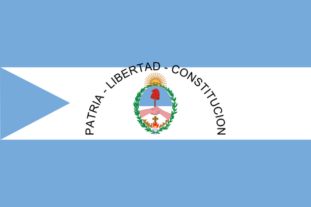
20th - Salta
What? You’re putting wine with black, this is basically non-sensical.
21st - Jujuy
😴 Actually, why Argentinians love this coat of arms!?
22nd - San Luis
The only thing that make me smile is the love of deer and doe. Why to put a white background with a coat of arms? ;-; Andrew, Olivia, I go to your marriage if this flag be changed, sorry.
23rd - Autonomous City of Buenos Aires
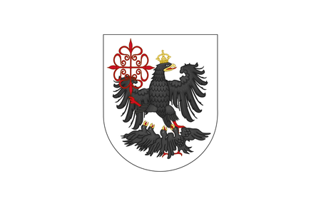
I just... can’t. Just...
24th - Formosa
“My dear. This is horrible. Horrible. Horrible. Horrible. Horrible. Horrible. Horrible. An outrageous. It makes me sick.”
— Paola Carosella (at MasterChef Brazil), and MG17 (at Recent User Blogs)
So... yeah. I tried to rank the Argentinian Province Flags. I think it’s a good ranking. What about your ranking? What is your best, and what is your worst? I will try to do more rankings, but no promises! And I tried to do something more fun (and explosive when needed), but that’s it.
Personally, I would have put Chaco way lower, but that's just me. Loved it! :D
Great blog! Flag blogs are always great! Even if someone made a spam blog just saying "flag" it would be a good blog because flags are great! Like the voting form for my flag contest!
i'm addicted to exclamation marks!Okay, I have lots of opinions so I'll write in another comment lol
“...even if someone spam flag...” 😐😐😐😐😐😐😐😐😐 can I spam neutral emojis then? Lol
Chubut? That's not that great... It's pretty good but the symbol in the middle ruins the theme.
Entre Rios and La Rioja are really funny lol
Tierra del Fuego should be first or second! It's one of the best flags in the world! Or at least a bit higher...
Rio Negro looks terrible, but at least it doesn't have a seal so I would put it above most of the seal flags.
I like the color combination of Salta, but I don't like the symbol.
Formosa is nice! At least put it above the seals...
So my Top 3 Best:
1. Buenos Aires
2. Tierra del Fuego
3. Cordoba
Worst:
24: Corrientes
23: City of BA
22: Salta
I think I will also get into this series! Maybe I will do Japanese prefectures.
never mind the fact that he did it when he was a year oldAnyway, I really liked the flags of Tierra del Fuego and Santa Cruz. The rest of the flags are in one word... boring. Sorry Argentinians, but you could have done better.