
National Flag Awards
First published: Thursday December 30th, 2021
Report this blog
Welcome to the National Flag Awards!
Welcome contestants (countries) to the National Flag Awards! In this awards ceremony, Countries from all around the world will get awards in different categories for their flags! Many people have made opinions about flags, but I wanted to do something a bit more special. So I will rank the top 3 flags for a certain quality, such as Aesthetics or Symbolism. And they will get Bronze, Silver, or Gold. Ready?
Most Representative/Best Symbolism
A flag can gain its place as a symbol of a country, but some flags seem inherently very representative, showing the core of the country itself, rather than abstract concepts that any country might use. This can be by cultural or natural symbolism. Here are the awards!
Nepal
🥇GOLD 🥇
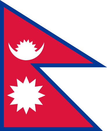
No other country could have done this. This is 100% certified Nepali. No other country is this proud of their mountains, of their cultural diversity, and their nature, this combination could only be Nepal. I love this flag overall.
Kazakhstan
🥈SILVER 🥈
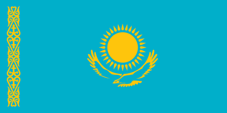
In 3 simple symbols and 2 colors I get an impression of this country, and that's what a flag should be. This could be another Central Asian country, but Kazakhstan did it, and it fits well. The bright colors remind me of the landscape of central Asia while the eagle and the pattern reminds me of their unique culture.
Israel
🥉BRONZE 🥉
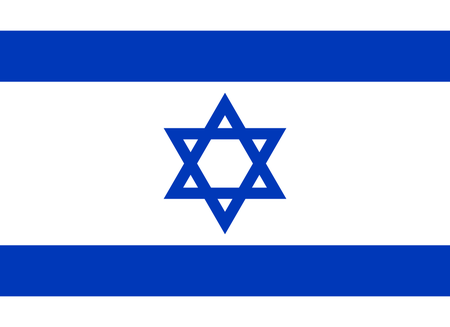
Israel is the worlds only Jewish state whether you like it or not, so of course it's fitting to use Jewish symbolism. That's pretty much it, not a big explanation.
An honorable mention to the European places whatever you want to call kosovo of Cyprus and Kosovo. They have the shape of them on the map on the flag, so, obviously they're representative. I just don't think it's that creative overall, so I'm not giving them awards.
Most Simple
Simple can be good or bad. It can mean that you can represent your country well with minimal detail, or it can mean that it is too abstract cough tricolors cough In this case, I am referring to the former, a design that is very simple, but can capture the country's symbolism well.
Japan
🥇GOLD 🥇
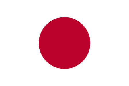
A circle. Anybody could have done that, but Japan did it and now it's their thing, and it fits. You could say it's uncreative like tricolors, but I think it's an example of simplicity, after all it represents the sun, which is a great symbol for Japan.
Turkey
🥈SILVER 🥈
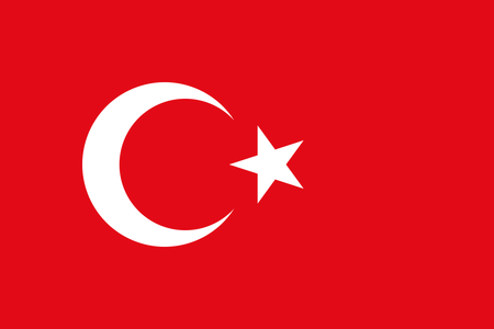
So many flags have a crescent-star in some way, but Turkey took the simple route, and it worked. It's especially fitting as the crescent-star is used as a Turkic symbol as well as Islamic, and red is not the main color of most Muslim-majority countries.
Estonia
🥉BRONZE 🥉

BUT THREAD YOU SAID THERE WOULDN'T BE ANY TRICOLORS-
While most tricolors aren't that great, using abstract concepts such as Faith, Liberty, Justice or whatever, Estonia takes their landscape and puts it on their flag. Blue for sky, Black for the dark forest, and white for the snow. That's an amazing concept put into a unique tricolor, and this is the best tricolor overall in my opinion.
Most Aesthetic
This is pretty self-explanatory. Overall, which look the nicest. There are many which look nice, but here are my favorites.
Brazil
🥇GOLD 🥇
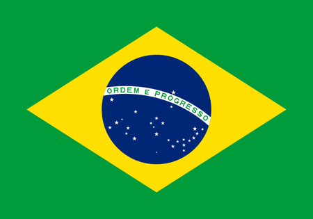
The colors and shapes look so nice and pleasant together, so at first glance, this is the most appealing aesthetically, which is why it gets gold.
mg removes the totally legal gun
Papua New Guinea
🥈SILVER 🥈
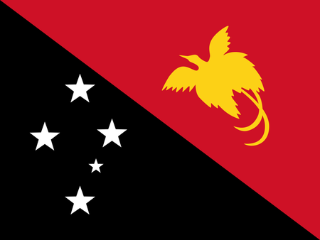
This is one of, if not my favorite flag overall. I love the color scheme, the format, and the symbols. The Bird of Paradise is also a great symbol and looks great being stylized like this. Overall it's very nice and unique.
South Africa
🥉BRONZE 🥉
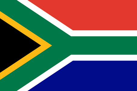
"What colors should we use for our flag?"
"Yes"
"Sir, you're a genius"
This looks beautiful! All these colors come together so nicely and uniquely. I might have a changed a few colors, but at first glance it looks very striking.
Most Making-me-not-want-to-invade-them
Or in other words most intimidating. Intimidation is of course a very important part of flag design, you can't have your enemies making fun of your flag!
Albania
🥇GOLD 🥇
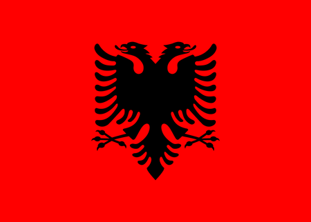
First they chose the most intimidating colors, and then they had a super-cool eagle? I definitely don't want to mess with them from seeing the flag.
Honorable Mention to Serbia and Montenegro, who also have cool eagles, but Albania's colors add to the intimidation factor.
Bhutan
🥈SILVER 🥈
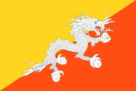
First of all, why would you want to invade Bhutan?
Second, DRAGON.
Sri Lanka
🥉BRONZE 🥉
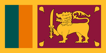
This is one of my favorite flags, but I wasn't sure what would be the best category for it. The lion is pretty cool with the sword, and the colors and patterns look ancient and unique, so I wouldn't want to invade and get rid of this flag.
Most Clever
This is one of the best parts of flag-design. When your country has a lot of symbols, combining them into a really cool abstract symbol is a really clever and cool way to be creative and give your flag a simplistic look, which I really like. i used so many adjectives in that sentence
Kyrgyzstan
🥇GOLD 🥇
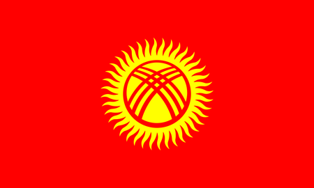
Everyone knows this flag because it's the "XBOX flag" -_-
It's actually a really good flag though. The X symbol represents the top of a traditional Yurt, or nomadic hut. The sun's 40 rays represent the 40 tribes that rallied under Manas, the national hero, the countries name coming from the word for 40. Small touches like that can really add to the symbolism of a flag.
Iran
🥈SILVER 🥈
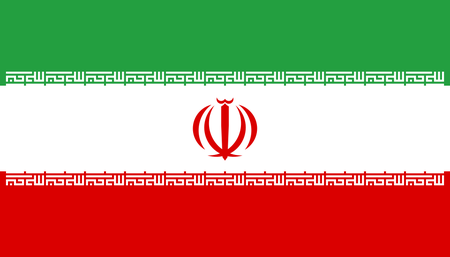
At first glance, Iran's flag looks very unique and has a different look from other Islamic flags. The patterns around the Green and Red bands add a nice aesthetic, but also represents the Takbir written in the Kufic script. Meanwhile, the central symbol is rearranged version of the letters for Allah, or God. Whatever you think of the Islamic government, this is a very clever and nice design.
United Kingdom
🥉BRONZE 🥉
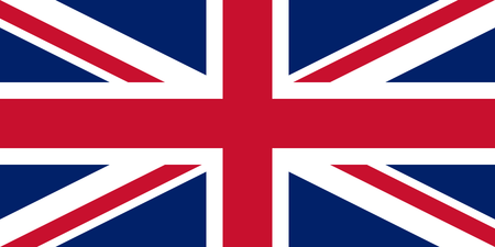
"Sir, we are uniting some countries! Can you make a new creative union flag for us?"
"Sure"
*puts the flags of the previous countries in a blender*
"Here you go!"
For a flag that's literally a combination of 3 crosses overlayed, it looks pretty good. But WALES!!!
imagine if they counted all of their colonies as official parts of the uk as well
Best Color Scheme
Color is what defines a flag coughs at libya before 2011. If flags were food, colors would be rice asians will get it. These are the flags with the best colors overall, from uniqueness, symbolism, and how they are used.
Jamaica
🥇GOLD 🥇
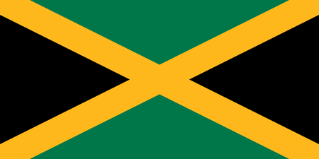
Only real flag nerds know why. If you don't, this flag happens to be the world's only flag that doesn't have any shade of red, blue, nor white, so it wins the uniqueness factor, and I like the color scheme they chose, as well as the flag in general.
Comoros
🥈SILVER 🥈
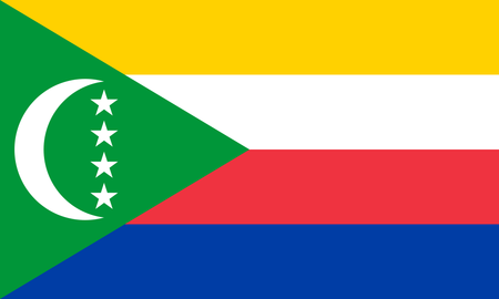
I mainly like this flag because it's so colorful. The colors represent the different islands, and it's pleasant overall.
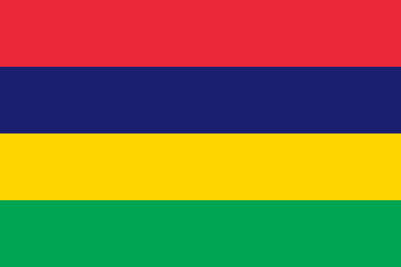
Mauritius
🥉BRONZE 🥉
It's colorful, unique, the shades look nice. That's all.
Honorable mention for Sri Lanka and South Africa who already got awards, but also have great colors. SL has some of the most unique and nice-looking colors in any flag, and RSA is obviously known for it's colorfulness.
Hope you enjoyed this short blog because i didn't, I started writing it and decided to post what I have. By the way, I'll end the voting for the JetPunk flag on New Year's Eve and the flag will be announced in a separate blog on New Year's day.
Here is the form if you haven't voted yet.
also you can see my quizzes or youtube channel or whatever i'm too lazy to add links
mate!Yeah, Australia really needs a better flag. If you want, you can do it! Maybe I can do for Indian states! There are lots of flags the JPCom can improve lol
Most colorful would probably be South Africa, and all the others are way below, so I did best colors in general.
a mere thank you does not sufficeVery inspiring, I have now put another possibility onto my list of blogs to follow the Capital City Origins series I finished earlier.
The potential blog would be the meaning of each country's name and the symbolism behind it's flag. I say I've added it to my list, however, if you want to make a similar blog I will remove it.
Once again, great blog.
Just Kidding. That's not the problem. I have no hate against the taller than wide ration. The problem is I lied. The 4:3 is for the Red only. No blue trim
The REAL ratio is like: 4.39892839283928:3.8293832.
Bruh