
The Blog Editor #2 - Headings and Dividers
First published: Saturday April 10th, 2021
What are Headings?
Headings are similar to Text Components, except they are always bold and don't have a style bar. The intention is that these are used for subsections throughout your blog. You can add them using this button in Step 2 of the new Blog Editor:
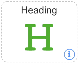
This will create a new Heading which you can type directly into. It doesn't accept HTML, so typing it will just show the actual symbols like <b> or something.
Headings are also used as part of the "Quick Links" section of the blogs. This is enabled or disabled using the checkbox on the right-hand side of Step 2. When enabled, it will place a shortcut link to every Heading at the top of the blog, making it easy for blog readers to navigate your blog more quickly.
Heading Options
There are many options available for Headings, and these are accessible by clicking the 3 dots on the far-left of any Heading. They may be difficult to see, but they're there. Clicking these dots will open up the following screen:
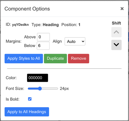
This options panel has several options, I'll go through them all one-by-one.
The first half is common to all components (not in Split Views). They show the type of component it is, as well as it's position on the screen, with the ability to shift them up and down if you don't want to drag and drop them.
The options for margins allow for greater flexibility over the spacing of components above and below each component, these can be useful in some situations. Align has 4 different options:
1. Auto - this option uses the default for each component. For Dividers and Images, that is center-aligned, but for everything else that is left-aligned.
2. Left - align all text within the component to the left-hand side. Note not everything in a HTML component will be moved, e.g. tables.
3. Center - similar to 2 except everything is aligned in the center, so if you want central headings you can use this.
4. Right - and finally right-aligned, which works the same as 2 and 3.
You also have the option to apply those styles to every component, which is helpful if you want everything to have the same margins. As well as duplicating that element (placing it directly afterwards) or removing it.
For the Heading-specific options, the default values are shown, but I'll go through each one specifically:
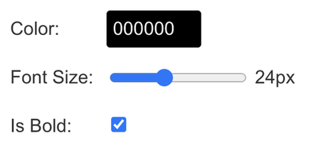
This is a colour Heading
This is a smaller Heading
This is a non-bold Heading
That's about it for Headings! You can also apply all the Headings-specific styles to all Headings in your blog, if you wish to have some uniformity.
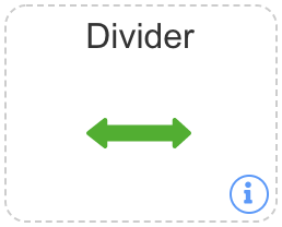
What are Dividers?
Dividers are a way of separating out sections of your blog. Ideally, these are used to signify a new subsection, such as what I used here. Previously, bloggers used to use the <hr> code in HTML to simulate this effect. The problem with that, is that these are fixed styles, and it's difficult to edit their height, colour or width without CSS, and on some browsers / devices <hr> components don't show custom styles at all! All of which are a problem when it comes to flexibility.
This is where JetPunk's custom Dividers come in handy, you can add them using this component:
These Dividers work all their magic in the component options, accessible via the three dots on the left-most side of every component. This opens up the following options:
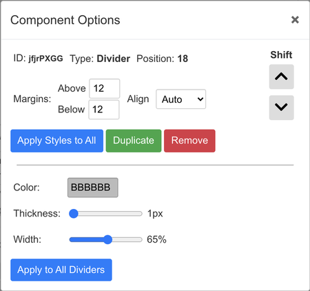
The options presented to you are useful for customising the appearance and look of your dividers within your blog. In particular, the colour, thickness and width of them. Let's take a look at some of what is possible with these components.
The first 3 are all using the default values, except the colour, thickness and width has been modified, respectively.
The 4th shows how you can combine all those together to create your perfect divider.
You can also utilise the align style to align them to the left, middle or right, which can be useful for creating your own unique style. See the 3 in action below with 50% width:
Overview
Headings are very useful at providing distinct signals to readers that something new or a change of pace is occuring. For example, I just stopped talking about Dividers, so it made sense to make a new Heading to reflect that!
Headings also have the unique ability to be included within Quick Links, which is not possible to achieve with HTML only, since you can't make the links actually move the page.
Dividers could be replicated in HTML, however doing so is more complex than just typing <hr>, since this doesn't allow for any styling at all, and is rendered differently on all browsers and devices. Also, why would you waste your character count when you can add a Divider for FREE! You literally lose nothing by adding a Divider, and gain so much in structure within your blog, as well as style options.
I hope you found this second installment useful, and I hope you enjoy using Dividers and Headings to your heart's content. Here's a little special sign-off, only achievable with ease using the new editor :)
<hr style="margin-left:0px;width:500px;color:dodgerblue"/>
Result: