The Blog Editor #4 - Split View Components
First published: Thursday April 15th, 2021
What are Split Components?
We now move onto the final Component-specific blog in this mini-series. After this there will be a blog about using the new editor on Mobile, and then we're done!
Anyway, moving on to Split View.
You may have noticed by now that all components in the Blog Editor take up 100% of the width of the page by default. This is actually not just by default, but by design. This means if you want to put anything next to each horizontally, you need to use a Split View. Splits allow you to partition that 100% width to allow two components to be placed next to each, for example to have two images side-by-side.
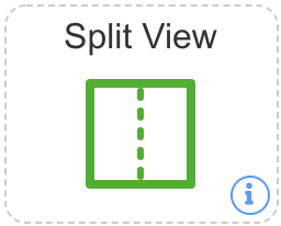
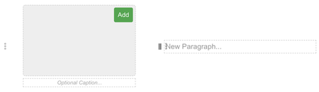
To create a Split View, simply drag and drop this component into your blog:
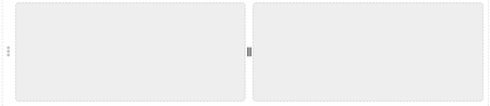
This will create a new split component, which looks like the below. By default, we are in Horizontal mode, and the partition slider is in the middle of the component.
Basic Functionality
Okay, so you have a Split component. What's the bare basics of what it can do?
Thanks for asking! :)
So, the very basic thing you could do is to drag an image component into each half of the split view, this would look something like this:
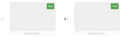
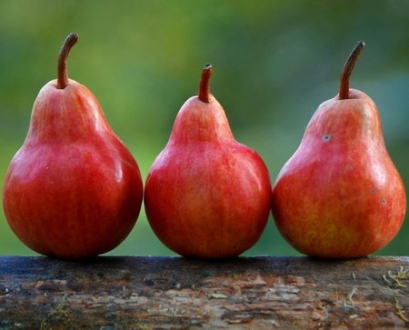
After this, you can add an image to each side independently. For example something like:
Now, we have two images, but due to their sizing they are different heights - disaster! I think not.
You see, remember that slider in the middle? Well, we can use this to change the proportion each half of the split takes. In this case, we could drag the slider to the right a little to get the images evenly sized. In the end, this would end up with the split images looking like this, which is exactly what we intended to achieve in the first place!


Split-ception
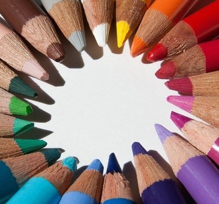
So, I'm sure you might be thinking, can I split a split? Blasphemy! Well, actually the answer is yes, you can put split components inside other split components, however, there is a limit depth of 3. This means you can put a split inside a split inside a split, but no further. At maximum, you can then get 8 "columns" across, by adding splits everywhere. If you did this with random images, for example, you could get something like this:


And of course, you don't have to arrange them like this, you could also do a 2x4 grid for example, or anything else you can imagine up within the constraints.
Practical Uses
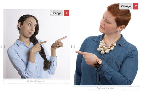
So what are some practical uses to this new feature? Well, a popular "view" of blog articles is to have a picture on one side and text on the other.
You may also have noticed in the options menu for Split View some strange things, we'll go through that now, using a split view.
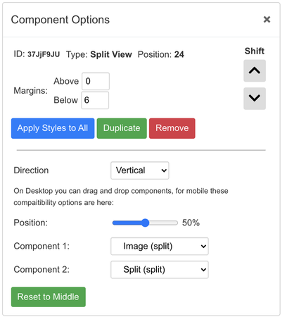
Split Options
These are the options for a split component. By now the top half should be more than familiar to you, as these are common to all. However, notice that Split Components do not have an alignment, since they are always 100% filling the space.
The Direction selection is the most important option here, since the others are compatibility measures for mobile bloggers which will be explained in the final blog of this mini-series.
You can choose to split a split view vertically (the default) or horizontally. Horizontally is only really useful inside other split components, as has been done for this view!
And, as promised, here is what that looks like in the blog editor itself:
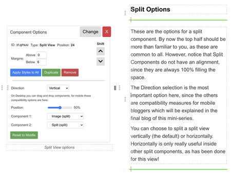
It may look complicated, but I'll try to highlight as much as possible. So, first and foremost, because of the slider in the middle of splits, and the options button on the left, the view looks different than the actual blog itself. So always preview split views. That's my advice at least.
In terms of structure here, we have a Split View (#1) with an image component on the left, and then a Split View (#2) on the right. That split view has been set to Horizontal, so we can stack two things on top of each other, and then inside both top and bottom are two more split views split horizontally. Perhaps it would be easiest to show you what this looks like without components inside it:
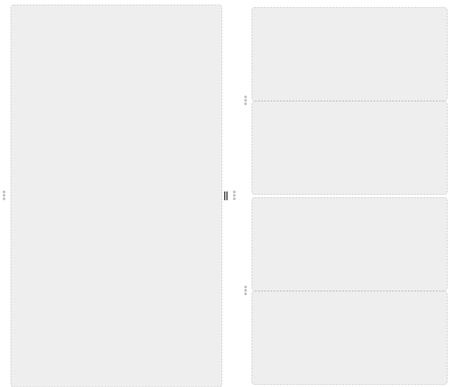
As you can see, the small white gap in the middle on the right indicates the split for #2, with a split placed above and below.
Overview
As I prefaced this, Split Components are complicated, to say the least. They can be tough things to wrap your head around, but hopefully this has removed some of that confusion to implant ideas of the future.
Split Views have the power to transform a blog into something that looks even more professional, but can also be abused very easily, as it's not so easy to make them look good. With practice though, I'm sure people will come up with clever things to do with them.
This is the end of the individual component blogs. I chose not to do one on HTML Component since this is an advanced feature, and there's plenty of blogs about HTML already, as well as an abundance of information online about how to do HTML (though I hope I convinced you by now you don't need to use HTML for most purposes anymore!)
The final blog in this mini-series will focus specifically on the features of the Blog Editor on mobile, since the use of drag-and-drop is inherently not going to work on a touch screen device. You can look forward to that in the near future, and then this series will be done! forever
Maybe the solution is to create a blog to leave unsubmitted and play around with the seemingly endless features
On mobile it's more complicated as you can't drag. Open up the options for the destination split, you'll see two boxes to select a component. Use these to select which component to place into the split.
I'll explain the mobile one in more detail in #5 of these. It's taken a really long time to make though as I've been busy.