
US States' Worst Flags Ever
Last updated: Thursday December 3rd, 2020
Report this blog
Note: I don't mean to offend any person or group of people with these blogs. They are 100% based on taste. The flags used must have been the flag after the state gained statehood.
Alabama
1861 Flag
Front

Back

The 1861 Flag could be unlucky to find itself on this list, but it's a monstrosity nonetheless. The words "Independent Now And Forever" and "Touch me not" on there make it even worse, and the lackluster sketches don't help either. The current flag may resemble a certain flag, but it's undoubtedly much cleaner and, frankly, better looking than the 1861 Flag.
Alaska
Current Flag

Personally, I'm a bug fan of this flag. Unfortunately, it's Alaska's ONLY flag as a state, so it makes it on this list by default.
Arizona
Current Flag

Again, there's no other choice. I'm a fan, but the flag is, by default, the worst that Arizona has had (it's also the best, but that doesn't matter).
Arkansas
1924 Flag

This one beats out almost identical flags to make it to the bottom of the list. The blue doesn't match with the other colors, the stars aren't all pointing in the same direction and there's the nod to *that* flag again (see Alabama).
California
Mary Todd Lincoln Bear Flag
Original
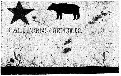
Digital Recreation

The Lincolns are celebrated for many things. This most definitely isn't one of them. Nor should it be because it's an abomination. The original is bad, but the digital recreation, considering the resources available, is just sloppy. What really annoys me, however, is the font. Text in flags is already a bad idea, but a font with serifs makes it worse. It's even worse when you consider that even Lubbock, Texas and San Francisco have figured that much out.
Colorado
1907 Flag

It's a coat of arms on a blue background. At least it wasn't actively bad, but it's as vanilla as it gets. In fact, I'd call the flag good for such an uncreative flag, but the lack of effort put into it is what I'm getting the most.
Connecticut
Current Flag

The flag of Connecticut isn't bad for its format, but it's still a coat of arms on a royal blue background. There's not much else to say. It's also the only flag that was used after the United States gained independence.
Delaware
Current Flag

Delaware's original flag is still in use, and the flag is pretty inoffensive. There's no controversy surrounding it, but its appearance is pretty unflattering, due to the "December 7, 1787" written at the bottom. It's not the worst, but it definitely isn't the best flag you'll see on this list.
Florida
Current Flag

The flag of Florida has gone through a few iterations, most of which are similar. The current one has the fairly obvious nod to a certain (controversial) part of history in the southern United States, and the seal has way too much going on.
Georgia
1956 Flag

Come on, at least try to make it more subtle than that (see Alabama again, this theme comes up a lot).
Hawaii
Current Flag

This is the only flag Hawaii has had as a state (and for some time before that as well), and it's not terrible. The Union Jack does make this substantially worse, though. It just feels out of place.
Idaho
Current Flag

There's not a whole lot to say. It's the only flag and it's pretty bland. I don't have any real problems, but I'd like to see more variety, please.
Illinois
Current Flag

A: Hey, I want our flag to be different.
B: Me too. There are too many flags that are just a seal on a field of blue.
A: Wait... what if we used a white background?
B: It's genius!
*slow clap*
Indiana
Current Flag

It's a refreshing change of scenery, but it lands itself on here because it's Indiana's only flag. If only the word "Indiana" weren't there...
Iowa
Variant Flag

I don't know if this counts, but it's similar to the original. The only difference is that the eagle looks much less bold and the font is just ugly.
Kansas
Current Flag

Looking at it once, you can tell that it's a state flag. You can tell that it's the flag of Kansas. It's straightforward, but it's still a seal-on-blue flag.
Kentucky
Current Flag

Again, it's the only flag that Kentucky has had, but it's still deserving of being the worst. Who decided on that font? It's supposed to be flown, but there's no way that anyone's reading "Commonwealth of Kentucky". It's barely readable when it's not being flown.
Louisiana
1861 Pelican Flag/1861 "Star and Stripes Flag"*


Well, 1861 was a bad year for Louisiana flags. The pelican flag features text and a deformed pelican (take a closer look), and the "Star and Stripes" flag looks like it was trying to be communist (and failed).**
*I made that name up.
**For those wondering, the Communist Manifesto was published in 1848. The flag was adopted in 1861.
Maine
1901 Flag

"Oh wow, it's a tree on a tan background with a blue star. I wonder if that's going to have a positive impression on people."
-probably no one, attributed to me
Maryland
Current Flag

It's a distinct flag and I like it. It just had the misfortune of being Maryland's only flag. The boldness of the color palette is much appreciated, as is the fact that they didn't just do what every other state did.
Who chose apricot?!?!?!
Florida is actually based on the old Spanish flag.
Georgia is still the stars and bars today.
I like Hawaii's flag.
Illinois: I like the description.
Indiana has too much going on.
New Mexico: Not on here yet, but be sure to include the "SpongeBob Title Card" flag with the US flag in the canton.
Spot on
Population: BRILLIANT IDEA!
Result: ... yuck