English County Flags Ranked From Best to Worst
Last updated: Monday April 5th, 2021
Report this blog
Well, this is an extremely original idea. I figured that the English County flags are just too distinctive to pass up making a list on. Please note that I know very little about this subject, and that all of the flags will be of the historic counties.
1. County Durham

This flag is one of my favourites. Nice colour scheme, strikes a good balance between simple and complex, and has a cool countercharge, which I feel are underutilized.
2. Somerset

Alright, I might be slightly biased, but this is a great flag. The yellow and red go very nicely together, and the dragon tops it all off, making up for its slight simplicity.
3. Buckinghamshire

That is one cool looking swan. My only problem with it is that the grey is too light, and it looks quite faded. It bears resemblance to a logo because of this for some reason, although it is still a good flag.
4. Wiltshire

The colours of this work very well together, and this flag definitely has some of the most interesting symbolism. The alternating stripes represent the grassy downs of the county and their chalk underlay, with the green and white also representing safety and peace. The circle in the centre also has some symbolism behind it, but it doesn't work as well with the rest of the flag.
5. Hampshire

I really like red and yellow together on a flag, and this definitely delivers on that. Other than that, its a fairly nice flag, and avoids being too complex despite the two symbols it has.
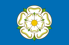
6. Yorkshire

Although it may be slightly too simple, there is a reason why it is so recognizable.
7. Herefordshire

Although this flag isn't the most interesting, there isn't anything wrong with it either. The wavy lines are a nice touch.
8. Nottinghamshire

A pretty good flag, but the shield looks odd without a border.
9. Lancashire

Another red and yellow flag. However, the flower almost looks cartoonish due to its lack of detail. Still distinctive though.
10. Cumberland

Initially the shade of green seemed too light to me, but it works with the white and blue. However, the flowers just look awkwardly positioned.
11. Warwickshire

Eh, I can't tell what it is, but it looks alright.
12. Cornwall

Very, very simple, but the white really stands out on the black.
13. Westmoreland

I put these flags into a definitive order before I started writing my thoughts on them, and this one is better than I thought then, with the apple tree at the centre working well with the bars.
14. Suffolk

Relatively uninteresting, but I wouldn't call it bad. The colours are alright.
15. Worcestershire

The shield looks too wide and large. However, the background isn't too bad.
16. Essex

Another fairly boring one. That's all I have to say.
17. Middlesex

There is nothing I can add to this flag, except from the fact it looks more cramped than the above. I also put it lower because it is newer than the flag of Essex.
18. Huntingdonshire

Another one which I wish I put higher. I still don't know what is happening in it, though.
19. Oxfordshire

The symbols on the corners really don't work with the rest of the flag, but the colours are quite nice.
20. Berkshire

Too complicated and looks a bit like a child's drawing. At least the yellow background works alright.
21. Dorset

You know how I said I like red and yellow on flags? Well, this is an exception. The dark on light doesn't work, and it is also very simple. Which is a shame, because if the colours were reversed it would be a decent flag.
22. Devon

Instead of bringing out the white like the Cornish flag did, this flag just pushes back the green. I can't even say that it wouldn't be bad if the colours were reversed; the two dark colours just don't work with each other.
23. Sussex

Boring and with a poor choice of colours.
24. Lincolnshire

Another extremely boring flag (much like the county.) The diagonal green and blue sections make the flag seem too complex, but there isn't anything interesting on it that could make up for that.
25. Rutland

It's like they just chucked every symbol related to Rutland on a flag randomly.
26. Staffordshire

How many times can I call a flag 'boring'?
27. Norfolk

Did a dog step on this flag or something? Also, the bend looks strange going from right to left.
28. Gloucestershire

Just look at the colours, I think this is fairly self-explanatory.
29. Hertfordshire

This is a prime example of a flag where the wave pattern doesn't work. The shield of the flag also clashes badly with it.
30. Cheshire

Flat and boring. It's almost like it was deliberately designed that way.
31. Shropshire

Similar to the flag of Norfolk in pattern, but with colours that clash together and some poorly places leopards.
32. Kent

Are horses supposed to look like that?
33. Northamptonshire

The colours are too dark for this type of flag, and the rose in the centre is laughably small.
34. Derbyshire

The border is very small, and the cross is huge. To top it off, the colours are a joke.
35. Cambridgeshire

The colours seem to blend into each other. I can't really say much more about this one apart from that it's awful.
36. Bedfordshire

The visual representation of nausea. The bright colours and wavy lines cause this effect, and the shells in the centre don't help.
37. Surrey

Are these even flags at this point?
38. Northumberland

Oh god. This one is self-explanatory.
This design must be one of the oldest having been used in the Earldom of Chester since the 12th century.
Also Northumberland looks like the markings on a gear stick