A Defence of the Mercator Projection
Blog by
Last updated: Sunday January 10th, 2021
Report this blog
Last updated: Sunday January 10th, 2021
Report this blog
+2
The Mercator Projection is often used as a reason for why certain geographical facts seem surprising. Canada is smaller than both the USA and China if you don't count its lakes? Mercator projection! Maine is the US state that is geographically closest to Africa? Mercator Projection! Norway is a bit more sloped southwest to northeast than you might imagine? Mercator Projection! New York City is further south than Rome? Mercator Projection! Algeria is now the largest country in Africa (since the independence of South Sudan in 2011)? Mercator Projection! If you go south from Detroit, the first other country you get to is Canada? Mercator Projection! New Zealand exists? MERCATOR PROJECTION!!!!!!!
So what, if any, of this is actually caused by the Mercator Projection? The first question to be asked in such circumstances is what the Mercator Projection is. After all, it would look a little foolish, would it not, if you blamed a projection for your problems that you had only ever used once or twice, when some other projection was in fact to blame for the majority of your difficulties.
What is the Mercator Projection?
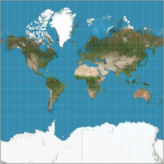
The Mercator Projection is the projection in the thumbnail of this article. A handy characteristic feature of the projection is that Greenland and Africa look about the same size on it. Technically, a Mercator Projection should go infinitely far up and down, so that in the southern hemisphere Antarctica goes down forever, and in the northern hemisphere after Greenland ends there is sea going up forever (though it is usually frozen over). For the reason that there is nothing especially interesting above 85°N or below 85°S, as well as because printers do not tend to have an infinite amount of paper to spare, the Mercator Projection is typically truncated at around 85°N and 85°S. This particular example is truncated at 85°3'4" N and 85°3'4" S, and has the useful property that the projection is a square. Greenland's northernmost point is at around 83°N, so if a projection includes all of Greenland and is not very close to a square, it is not a Mercator Projection.
In particular, the map used in Jetpunk's Countries of the World Quiz is not a Mercator Projection. I could be wrong, but I believe that it is the Miller Cylindrical Projection, which is similar to the Mercator Projection but acts as if everything has been squashed north-south by a factor of 4/5 (so if a point on the Mercator Projection represents a point at 40°N, the same point on the Miller Projection represents a point at 50°N). This makes the projection finitely large, even if you include all of Antarctica and the Arctic Ocean right up to the north and south poles (though to save space Jetpunk's map doesn't do this).
In the UK, and I assume many other countries though I cannot be sure, maps used in schools tend not to be the Mercator projection as it makes African countries appear so small that they are difficult to fit labels into, while unimportant land in Greenland, Siberia and Canada that will hardly need any labelling at all is made larger than it really is.
Why would anyone use the Mercator Projection?
Despite my statement that on world maps the Mercator Projection is used a lot less often than many people seem to imagine, there are still maps that use the Mercator Projection. There are two main reasons for this, and the Mercator Projection is unique in these aspects. Practically, they make the Mercator Projection by far the best in these cases, even though it may not convey an "accurate" picture of the world as a whole.
Reason (I): The Mercator Projection maps curves on the Earth's surface that form a constant angle with meridians to straight lines. This was the original reason the Mercator Projection was invented. Before more complicated navigation systems were invented, ships travelling in an ocean with no distinctive landmarks had to rely on compasses as a navigation tool. Compasses tell you which way is north, or in other words, the orientation of the meridian you are on. Sailors would then take a bearing and travel constantly at, for example, a bearing of 312 (roughly northwest). Even though this isn't strictly the shortest path, it is the one that had least room for error at the time. In a Mercator Projection, a bearing of 312 points you in a straight line. This isn't true of other projections.
Reason (II): Locally, the Mercator Projection preserves the shape of an object. This is the reason why internet world maps tend to use the Mercator Projection or a slight variation thereof. Usually people want to use them to zoom in on a small area and expect to find their house to be the shape that it really is. They do not want it to be stretched (as it would in any world map that preserves area) and certainly not slanted (as it would be on many maps that do not have meridians mapped to straight lines). If their house would only be half the size were it moved to the equator, that really doesn't matter since they will not be comparing their house to one on the equator, as you cannot zoom in on both at the same time. If somebody put a British £2 coin 2.5 metres from the north pole, its shape would only be minimally distorted from a circle, but it would appear the same size as Greater London.
Is the Mercator Projection the best one to use?
The answer to this question is that it depends. If you want very small sections of the map to look the right shape (if completely the wrong size compared to parts that are further away), then the answer is yes. If you are a sailor who does not have the benefit of modern technology and wants to travel at constant bearings, then the answer is also yes (but I am very interested in how this can possibly be; please comment if this is the case). Otherwise, probably not. But you will have to sacrifice the distortion of shapes, presumably in return for more realistic sizes. A large selection of choices can be found here. I am not the first person to suggest the use of a projection that is not the Mercator Projection, so do not assume that any projection where the countries further from the equator look bigger than they would if nearer the equator is a Mercator Projection. Often, it won't be.
Is [insert outrageous problem to do with relative distances, areas, etc.] the Mercator Projection's fault?
One common problem given about the Mercator Projection is that countries closer to the poles look unfairly big. This is true, and in fact a lot truer of the Mercator Projection than of other projections to which this is also a common criticism. In fact, a country at around 60°N such as Estonia appears to have four times the area it would at the equator on the Mercator Projection. To make the problem worse, the closer to the poles you get the rate at which the extent of the issue increases only gets higher. Indeed, Greenland and Africa appear to be around the same size on the Mercator Projection even though Africa is actually 14 times the size of Greenland.
This may contribute to the surprise most people will express at the fact that if you exclude all of Canada's lakes it becomes smaller than the USA by area. Therefore the first objection raised at the beginning of this article is accurate, but only if the person got this idea by looking at the Mercator Projection. It may in fact be just as likely that the idea arose from another projection that also exaggerated the areas of countries that are further north, though usually to a lesser extent.
There are some other objections that are plausible but can be discredited when other factors are taken into account. People tend to imagine countries as being "north-south countries" or "east-west countries", and similarly coastlines, mountain ranges, and other geographical features that form rough straight lines tend to be thought of as going generally in one simple direction. Since, for example, the American coastline going from the southern tip of Florida to the tripoint between Maine, Canada and the Atlantic Ocean is called the "East Coast", people would usually imagine it as being roughly a north-south line, though giving it a little thought they would generally realise that Miami, Florida is a little further west than Portland, Maine. What they would not tend to realise is the extent to which this is true, and would assume that since Florida is further south it is closer to Africa (which is also not as far south as some people imagine; this issue will be covered later). Is the Mercator Projection also partially responsible, since it exaggerates distances further north and therefore makes the distance from Maine to the border between Morocco and Western Sahara longer than it ought compared to the distance from Miami to the border between Western Sahara and Mauritania? Well, sort of. But a careful examination of the Mercator Projection will reveal that even with this taken into account, Maine still appears to be the state closest to Africa.
Something that has nothing to do with the Mercator Projection is relative latitudes of different places. This is because parallels are mapped to horizontal lines in the Mercator Projection and so if Rome is further north than New York City in reality, it is further up than New York City on the Mercator Projection. The fact that things like this may seem surprising is more likely to be the result of biases based on things such as the climates of places. Because of the gulf stream, European climates tend to be anomalously temperate and warm for their latitudes.
I am writing this from Manchester, UK, which is at about 53°30'N. The only US state that is on the same latitude is Alaska, and yet the mention of the name alone invokes connotations of glaciers and ice sheets, as well as a few towns overwhelmingly in the southern part of the state. The total population in an area larger than all but 16 countries is less than one million. It is therefore natural to assume that other northern US States are more "like" the UK and so on a relative map someone might move the USA up by something like 5° compared to Europe. This is especially easy to do because the gap between the two on a map of any projection is large enough that the eyeline might not be quite horizontal over that distance.
Climate is generally a poor way to assess latitude. A way that would be useful if you have actually been to places would be how quickly dusk happens (i.e. the amount of time taken for daylight to cease and full-on night to begin). It is a significantly longer time in regions closer to the poles. Alternatively, I was quite amazed when I went to the furthest south places I have ever been (Crete and Virginia) by the angle the axis of the moon appears to be pointing. However, this is generally quite imprecise. In any case, these misperceptions are not the fault of the Mercator projection.
TL;DR
•Mercator projection is often not used and therefore not at fault
•Mercator projection is useful on internet maps and for sailors in the olden days for reasons
•Other projections are available
•Mercator projection may be but probably isn't misleading you about stuff.
So what, if any, of this is actually caused by the Mercator Projection? The first question to be asked in such circumstances is what the Mercator Projection is. After all, it would look a little foolish, would it not, if you blamed a projection for your problems that you had only ever used once or twice, when some other projection was in fact to blame for the majority of your difficulties.
What is the Mercator Projection?
The Mercator Projection is the projection in the thumbnail of this article. A handy characteristic feature of the projection is that Greenland and Africa look about the same size on it. Technically, a Mercator Projection should go infinitely far up and down, so that in the southern hemisphere Antarctica goes down forever, and in the northern hemisphere after Greenland ends there is sea going up forever (though it is usually frozen over). For the reason that there is nothing especially interesting above 85°N or below 85°S, as well as because printers do not tend to have an infinite amount of paper to spare, the Mercator Projection is typically truncated at around 85°N and 85°S. This particular example is truncated at 85°3'4" N and 85°3'4" S, and has the useful property that the projection is a square. Greenland's northernmost point is at around 83°N, so if a projection includes all of Greenland and is not very close to a square, it is not a Mercator Projection.
In particular, the map used in Jetpunk's Countries of the World Quiz is not a Mercator Projection. I could be wrong, but I believe that it is the Miller Cylindrical Projection, which is similar to the Mercator Projection but acts as if everything has been squashed north-south by a factor of 4/5 (so if a point on the Mercator Projection represents a point at 40°N, the same point on the Miller Projection represents a point at 50°N). This makes the projection finitely large, even if you include all of Antarctica and the Arctic Ocean right up to the north and south poles (though to save space Jetpunk's map doesn't do this).
In the UK, and I assume many other countries though I cannot be sure, maps used in schools tend not to be the Mercator projection as it makes African countries appear so small that they are difficult to fit labels into, while unimportant land in Greenland, Siberia and Canada that will hardly need any labelling at all is made larger than it really is.
Why would anyone use the Mercator Projection?
Despite my statement that on world maps the Mercator Projection is used a lot less often than many people seem to imagine, there are still maps that use the Mercator Projection. There are two main reasons for this, and the Mercator Projection is unique in these aspects. Practically, they make the Mercator Projection by far the best in these cases, even though it may not convey an "accurate" picture of the world as a whole.
Reason (I): The Mercator Projection maps curves on the Earth's surface that form a constant angle with meridians to straight lines. This was the original reason the Mercator Projection was invented. Before more complicated navigation systems were invented, ships travelling in an ocean with no distinctive landmarks had to rely on compasses as a navigation tool. Compasses tell you which way is north, or in other words, the orientation of the meridian you are on. Sailors would then take a bearing and travel constantly at, for example, a bearing of 312 (roughly northwest). Even though this isn't strictly the shortest path, it is the one that had least room for error at the time. In a Mercator Projection, a bearing of 312 points you in a straight line. This isn't true of other projections.
Reason (II): Locally, the Mercator Projection preserves the shape of an object. This is the reason why internet world maps tend to use the Mercator Projection or a slight variation thereof. Usually people want to use them to zoom in on a small area and expect to find their house to be the shape that it really is. They do not want it to be stretched (as it would in any world map that preserves area) and certainly not slanted (as it would be on many maps that do not have meridians mapped to straight lines). If their house would only be half the size were it moved to the equator, that really doesn't matter since they will not be comparing their house to one on the equator, as you cannot zoom in on both at the same time. If somebody put a British £2 coin 2.5 metres from the north pole, its shape would only be minimally distorted from a circle, but it would appear the same size as Greater London.
Is the Mercator Projection the best one to use?
The answer to this question is that it depends. If you want very small sections of the map to look the right shape (if completely the wrong size compared to parts that are further away), then the answer is yes. If you are a sailor who does not have the benefit of modern technology and wants to travel at constant bearings, then the answer is also yes (but I am very interested in how this can possibly be; please comment if this is the case). Otherwise, probably not. But you will have to sacrifice the distortion of shapes, presumably in return for more realistic sizes. A large selection of choices can be found here. I am not the first person to suggest the use of a projection that is not the Mercator Projection, so do not assume that any projection where the countries further from the equator look bigger than they would if nearer the equator is a Mercator Projection. Often, it won't be.
Is [insert outrageous problem to do with relative distances, areas, etc.] the Mercator Projection's fault?
One common problem given about the Mercator Projection is that countries closer to the poles look unfairly big. This is true, and in fact a lot truer of the Mercator Projection than of other projections to which this is also a common criticism. In fact, a country at around 60°N such as Estonia appears to have four times the area it would at the equator on the Mercator Projection. To make the problem worse, the closer to the poles you get the rate at which the extent of the issue increases only gets higher. Indeed, Greenland and Africa appear to be around the same size on the Mercator Projection even though Africa is actually 14 times the size of Greenland.
This may contribute to the surprise most people will express at the fact that if you exclude all of Canada's lakes it becomes smaller than the USA by area. Therefore the first objection raised at the beginning of this article is accurate, but only if the person got this idea by looking at the Mercator Projection. It may in fact be just as likely that the idea arose from another projection that also exaggerated the areas of countries that are further north, though usually to a lesser extent.
There are some other objections that are plausible but can be discredited when other factors are taken into account. People tend to imagine countries as being "north-south countries" or "east-west countries", and similarly coastlines, mountain ranges, and other geographical features that form rough straight lines tend to be thought of as going generally in one simple direction. Since, for example, the American coastline going from the southern tip of Florida to the tripoint between Maine, Canada and the Atlantic Ocean is called the "East Coast", people would usually imagine it as being roughly a north-south line, though giving it a little thought they would generally realise that Miami, Florida is a little further west than Portland, Maine. What they would not tend to realise is the extent to which this is true, and would assume that since Florida is further south it is closer to Africa (which is also not as far south as some people imagine; this issue will be covered later). Is the Mercator Projection also partially responsible, since it exaggerates distances further north and therefore makes the distance from Maine to the border between Morocco and Western Sahara longer than it ought compared to the distance from Miami to the border between Western Sahara and Mauritania? Well, sort of. But a careful examination of the Mercator Projection will reveal that even with this taken into account, Maine still appears to be the state closest to Africa.
Something that has nothing to do with the Mercator Projection is relative latitudes of different places. This is because parallels are mapped to horizontal lines in the Mercator Projection and so if Rome is further north than New York City in reality, it is further up than New York City on the Mercator Projection. The fact that things like this may seem surprising is more likely to be the result of biases based on things such as the climates of places. Because of the gulf stream, European climates tend to be anomalously temperate and warm for their latitudes.
I am writing this from Manchester, UK, which is at about 53°30'N. The only US state that is on the same latitude is Alaska, and yet the mention of the name alone invokes connotations of glaciers and ice sheets, as well as a few towns overwhelmingly in the southern part of the state. The total population in an area larger than all but 16 countries is less than one million. It is therefore natural to assume that other northern US States are more "like" the UK and so on a relative map someone might move the USA up by something like 5° compared to Europe. This is especially easy to do because the gap between the two on a map of any projection is large enough that the eyeline might not be quite horizontal over that distance.
Climate is generally a poor way to assess latitude. A way that would be useful if you have actually been to places would be how quickly dusk happens (i.e. the amount of time taken for daylight to cease and full-on night to begin). It is a significantly longer time in regions closer to the poles. Alternatively, I was quite amazed when I went to the furthest south places I have ever been (Crete and Virginia) by the angle the axis of the moon appears to be pointing. However, this is generally quite imprecise. In any case, these misperceptions are not the fault of the Mercator projection.
TL;DR
•Mercator projection is often not used and therefore not at fault
•Mercator projection is useful on internet maps and for sailors in the olden days for reasons
•Other projections are available
•Mercator projection may be but probably isn't misleading you about stuff.