Featured Quizzes
User Quizzes
Create Quiz
Data and Charts
Badges and Games
About JetPunk
JetPunk Shop
Random Quiz
Dark Mode
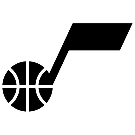
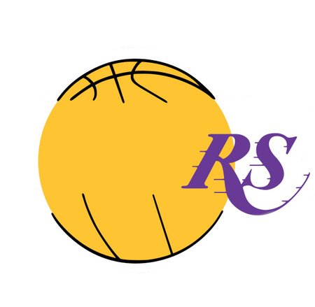
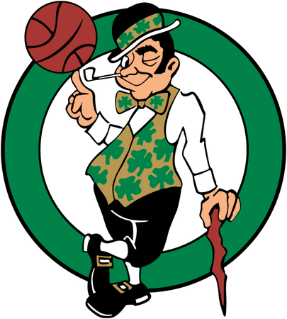
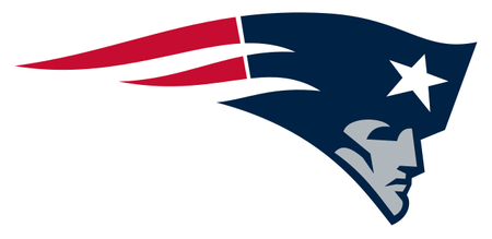
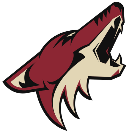
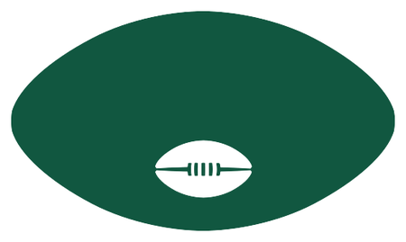
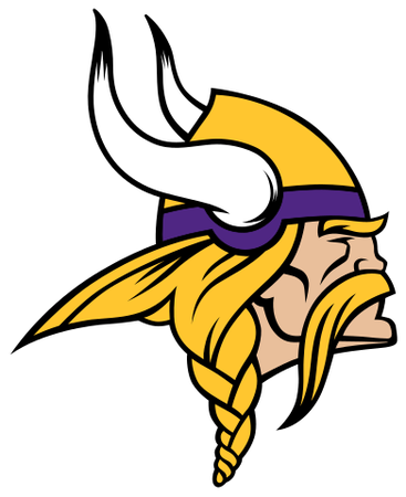
All North American Pro Sports Logos
Name the MLB, NHL, NFL, or NBA team that uses each selected logo.
Guess the team name, not the city
Answer must correspond to highlighted box
Some logos altered to remove text that would give away the answer
Rate:
Featured Quiz
Last updated: February 3, 2022
You have not attempted this quiz yet.
More quiz info >>
| First submitted | May 16, 2017 |
| Times taken | 75,372 |
| Average score | 75.0% |
| Rating | 4.67 |
12:00
Enter answer here
0
/ 124 guessed
Time Used
00:00
Best Time
00:00
The quiz is paused. You have remaining.
Scoring
You scored / = %
This beats or equals
% of test takers
also scored 100%
The average score is
Your high score is
Your fastest time is
Keep scrolling down for answers and more stats ...


New and Popular
Save Your Progress
Logo Series
Quiz series by KoljiVriVoda
Copyright H Brothers Inc, 2008–2024
Contact Us | Go To Top | View Desktop Site
All the teams (although Cleveland and Washington have since changed) in the second list use Native American mascots/logos. So, chetmanley's complaint is more that the Chiefs logo is problematic/offensive rather than poorly designed.
otherwise, awesome quiz
nice quizz