Map Projections Explained
First published: Wednesday April 28th, 2021
Report this blog
Introduction
Maps. They come in all sorts of sizes and shapes. But there is no perfect map. The earth is a spheroid. That means that it is almost a perfect sphere, but not quite. There are mountains and valleys, plateaus and hills. There are four aspects of a globe: size, shape, distance, and direction. Let's go through all of these:
Size: This talks about the size of features (did the size of a landmass change?)
Shape: This talks about the shape of features (did the shape of a landmass change?)
Direction: This talks about if any features moved in a different direction (did the direction between two landmasses change?)
Distance: This talks about if any features are closer or farther away from each other (did the distance between two landmasses change?)
Now, there is no way to turn a three dimensional globe to a two dimensional flat map. Imagine the globe as an orange peel. It's impossible for the Orange peel to flatten completely. And even if you tried as hard as you could, the distance and direction of shapes wouldn't be perfect. Mapmakers have found different ways to make maps. Here are a few of the most popular:
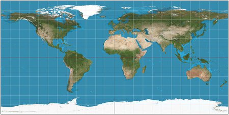
Mercator Projection
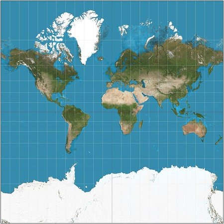
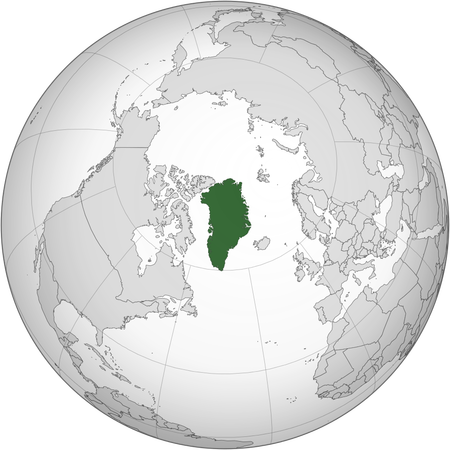
Do you want like direction? Well then, the Mercator Projection is for you. It was created by Gerardus Mercator, a Flemish cartographer, in the 1500s. Using complicated math, he was able to create a map with 100% accuracy in direction. It is widely used in schools all around the world. Direction is 100% accurate, which made it helpful for ships sailing from one place to another, who wouldn't need to keep resetting their compasses. Even today, a 90° turn on a Mercator projection map means a 90° turn in real life. This is why Apple Maps and Google Maps use it. But there are a few probelms. If you go to thetruesize.com, you can see this problem. For example, here is what Greenland looks originally:

But this is what happens when you drag it to the equator:

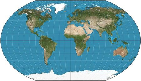
Try it yourself! You will find that not only Greenland but all of the countries near the poles are shown much larger than they really are. When you look very closly, you may see a bunch of rectangles. The ones near the poles are strechted out, while the ones near the equator are much more square-shaped. So if you want 100% accuracy in area, the Gall-Peters Projection is for you.
Gall-Peters Projection
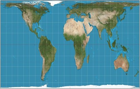

But this is what Greenland looks like on the Gall-Peters Projection:

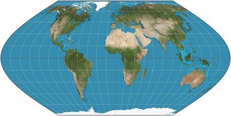
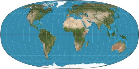
This is another example of how each projection will have different Pros and Cons. Here are more projections that I found:
Even More Projections
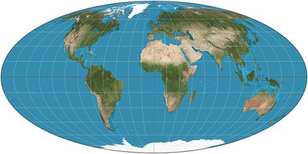
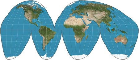
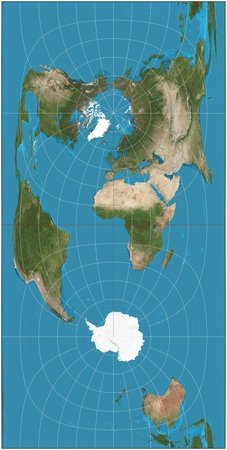
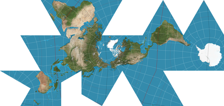
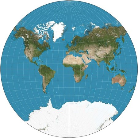
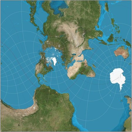
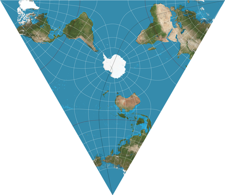
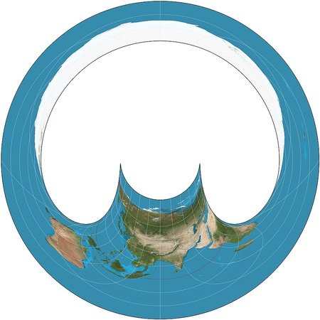

For more projections, go here
Thanks for Reading!
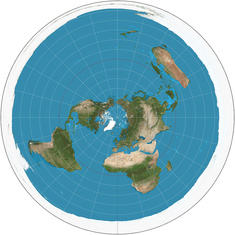
Stop
The
water
from
falling
off
I'm gonna update it soon
EDIT: Fixed! Thanks :D
(If you are asking about that face, Kazakhstankitten had a car accident, and... yeah, I think you know.)
EDIT I just saw the blog. :(
I worked about two hours on this one, this is actually a pretty simple one. I am working on another blog about discrimination against Asian Americans and Pacific Islanders (AAPI), which will take a long time.
Idk if this help, but when you said about the preconception of Asian-Americans, you can also mention the eurocentrism... 🤔