Less is More is Less is More
First published: Monday June 29th, 2020
Report this blog
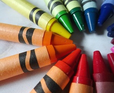
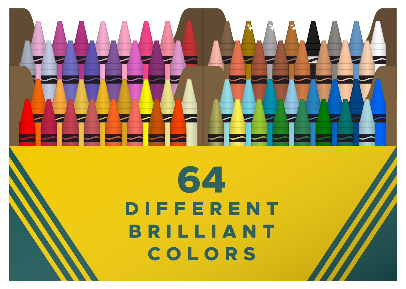
I have been wanting to take greater advantage of the SVG features as of late and today I designed a box resembling the original Crayola No. 64 box of crayons for a quiz (because Crayola is based in New Jersey, this quiz is in American English). There was an early comment commending the SVG, which I found both humbling and encouraging. This first design featured white outlines so as to distinguish each of the 64 coloured crayons.
Not long after publishing the quiz, I realised that I wanted to clean it up by making those outlines invisible. While I was at it, I added some gradients to provide a wee bit of a 3D image – totally early 2000s skeuomorphic graphic design (see this excellent video from Cheddar on how skeuomorphic design has fallen out of favour).
I'm throwing this out there to see if any of you lovely readers have strong feelings regarding 3D or 2D SVGs, or, in particular, if a 3D image detracts from the experience of taking this quiz (perhaps it makes distinguishing the colours that much more difficult?). So here are two different SVG images, one with the 3D gradients and one with a more 2D design. What are your thoughts?
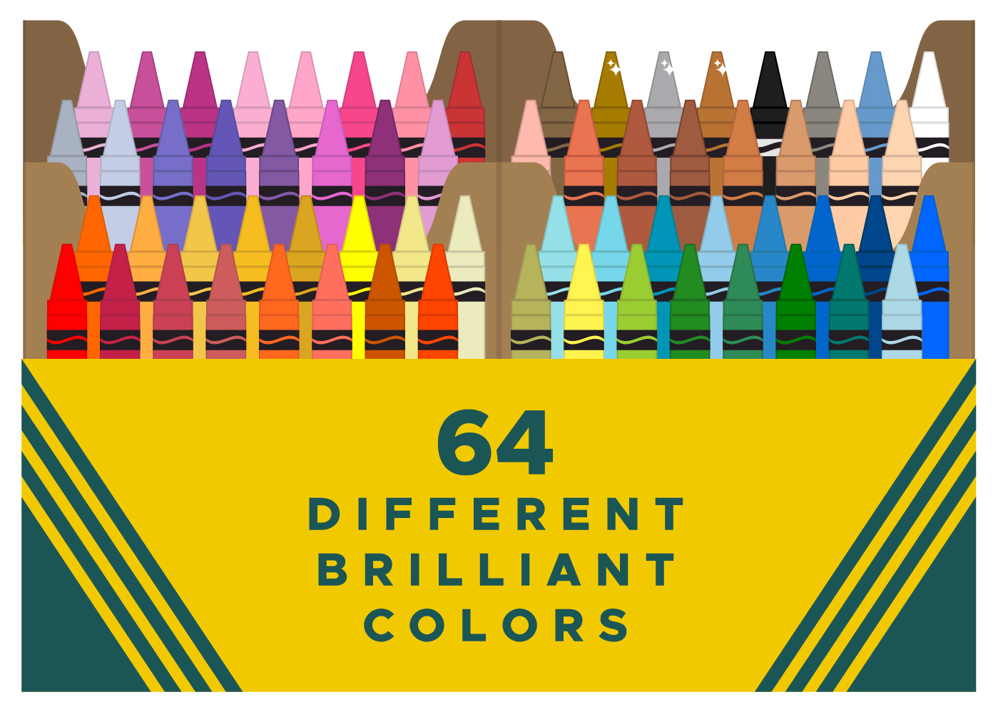
As I say, your quiz suited 3D and was rather fantastic!