Canadian Provincial Flags Ranked From Best to Worst

+3

1. Nunavut

This flag is simple, yet bold. There are no other flags quite like it and it is in a league of its own.
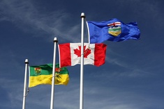
2. Alberta

I'm biased, but I really like our province's flag. The shield is complex, but not overwhelming and it compliments the Alberta Blue background.

3. Newfoundland and Labrador

Abstract design with a subtle Union Jack connection.

4. Quebec

The Fleur-de-Lys is a neat symbol, and Quebec takes it to the next level by adding four. C'est très bonne!

5. Saskatchewan

The green and yellow colours and the red flower go together beautifully. The top-left crest is a little unnecessary though.

6. British Columbia

Overcomplicated... but it is still pleasant to the eye, as it flaps majestically in the wind.

7. Nova Scotia

It's not that the flag looks bad. Rather, it looks like it belongs to a yacht club not a province.

8. Yukon

This one's alright. A little complicated perhaps, but the colours flow nicely.

9. Ontario

Do you want a flag that honours history. Do you want a flag that is bland as white bread? Ontario has you covered.

10. New Brunswick

It's just okay. I'm not a huge fan of the design, but the colours save it from a lower spot on my list.

11. Northwest Territories

Boring colours complete with a shield of strange patterns and a weird dog. They could have done better.

12. Manitoba

The other Red Ensign. However unlike Ontario (the self-proclaimed centre of our country) I really don't see why Manitoba has or needs it.

13. Prince Edward Island

Odd design. Looks like it was coloured in with pencil crayons. Keep on being you, P.E.I.

+8
Level 68
Jan 6, 2020
Great Blog Post! Also, as a Canadian, how dare you put the NWT so low. Their flag is amazing! The only bad flags are Ontario, Manitoba, and PEI. Hope to see more from you!
+5
Level 70
Jan 7, 2020
I appreciate it! I'd have to agree, in fact I really do think most of our flags are well-made. Will put out some more posts as ideas strike :)
+3
Level 23
Sep 20, 2020
Lol, I don't understand what's wrong with my flag (Ontario). Yeah, it's super boring and doesn't look good on a flag pole but on paper, it's got a nice aesthetic.
+1
Level 70
Sep 20, 2020
Personally I think it gets the job done. I like the aesthetic of the Red Ensign and I believe that if any province deserves to have one as their provincial flag, it is Ontario.
+2
Level 59
Oct 4, 2020
Alberta is the better version of every US state flag.
+2
Level 70
Oct 4, 2020
It does have similarities to many American flags, although I don't normally make the connection myself as I'm not used to seeing US state flags in the first place. The Albertan flag makes good use of a clean emblem, and lacks wording. If US states were to follow this example, they could look much better.
+2
Level 59
Oct 5, 2020
Exactly, US state flags are really uncreative and seem like they took zero effort to create, there the Alberta flag actually takes time to make it less cluttered. As for US state flags, I wish that I never saw them. They’re so plain that anyone - and I repeat, anyone - could make a more interesting version. And then there’s the old flag of Mississippi and Arkansas, which are somewhat similar to... another flag.
+2
Level 70
Oct 5, 2020
I noticed that when I went to Montana, their flag wasn't exactly inspiring. At least the new Mississipi(ian?) flag looks quite lovely, even though it has text on it.
+2
Level 59
Oct 6, 2020
The flag of Mississippi had the CSA battle flag in the top left corner and then they redesigned it this year.
+2
Level 76
Apr 8, 2021
Alberta is last in my opinion honestly. The emblem looks like it was drawn by a child, and it's just a generic coat of arms design on blue background, similar to basically every US state. At least Manitoba's flag has something going on, and the red background looks and "feels" much more Canadian.
+1
Level 70
Apr 8, 2021
Interesting. In retrospect I would probably put Alberta a little lower, maybe 5th or 6th, although I'm still a fan (Newfoundland and Quebec are certainly superior). When compared to American state flags it can seem quite similar, although I personally don't think much about US state flags and thus Alberta seems a tad more original, in my eyes.
+1
Level 51
Apr 19, 2021
...and because you live there?!
+2
Level 73
Aug 6, 2021
Nice one! My favourites are the flags of Nunavut and Newfoundland and Labrador. BTW, I made a similar blog ranking the Indian state/territory flags from best to worst. You might like it!
+1
Level 70
Aug 6, 2021
Thank you! Those are good choices and I will check out your blog :)
+2
Level 50
Aug 6, 2022
Lol I was just going to make a blog the same as this one (but I would have put Quebec first and Ontario last)
+1
Level 70
Aug 7, 2022
You should make your own version :D

And that's a fair choice, Quebec has a great flag.