Reviewing and Roasting National Flags (Part 1)
Last updated: Saturday February 5th, 2022
Report this blog
I had a lot of fun roasting US city flags in a previous blog, so I wanted to do more! I decided to do national flags of whole countries this time, because that seems fun. This is just for fun and I like most of these flags, I'm just trying to find something funny about them for entertainment. Hopefully I don't become an international criminal for breaking every countries flag respect law...
Let's start in the Americas! This blog will have North America, excluding the Caribbean, because Breaking News: I am lazy and can't make a complete blog in time for BG ;-;
Canada
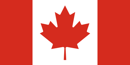
"Hey, that's a nice photo of a leaf you took!"
"Thanks!"
"Let's submit it to the flag contest!"
This flag is already roasted enough. You might've seen memes like this:
"USA: Flag for unity, France: Flag for revolution, Canada: LEAF"
So I'll give them a break. They're nice anyway.
United States
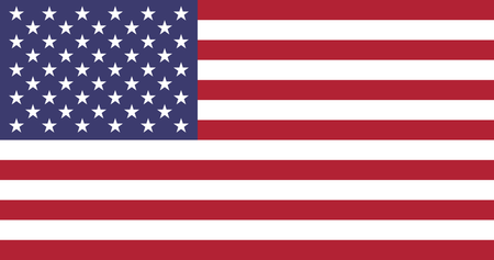
Considering how many Americans are abysmal at geography and history, it's quite helpful that their flag would show us the current and original states. Definitely better than its states' flags. And as an actual compliment, I like how they deviated from the traditional monarchy flags of Europe, which were standard at the time, and had some symbolism that is relatively unique and represents unity.
Mexico
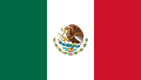
This is the flag with the most different species of animals on it. (yes i counted myself, belize doesn't count because the humans are the same species and montenegro doesn't count because two-headed eagle isn't a species) Oh yeah what were we talking about? Ah yes, this flag. It's quite unique. The Aztecs had a prophecy that they would build a city wherever they saw an eagle eating a snake on a cactus. And they saw it in Tenochtitlan, and now that's Mexico City! So it's definitely unique, I just wish they would simplify the drawing. The detail is great, but why would you put it on a flag?
Guatemala
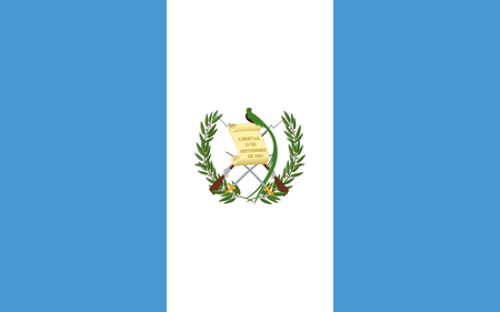
I was going to make a joke that it's ironic that there's a rifle on the olive branch, a symbol of peace, but it's actually the bay laurel, a symbol of victory ;-;
Anyway, why are there rifles AND swords? And this isn't a history textbook, so I don't need to see your Independence Day written out. Remember, Vexillography is an art! You can't just throw any government/national symbols you want!
This flag could be great if just a stylized version of the laurel and the quetzal, a great national symbol, the bird even being the namesake of their currency. It would also make a nice color scheme.
Belize
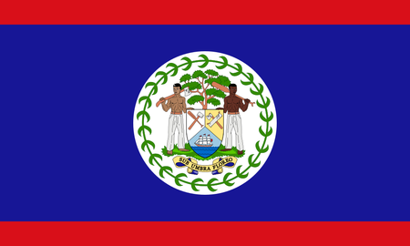
In the middle of a sea of white, we find a floating piece of grass. On this grass is a single tree and two men who have chosen not to wear a shirt. They are holding a shield thing that somehow appeared on this grass island. In this is a 2D ocean with a small ship floating while there are some tools all over. Do I have to say anything else? Oh yeah, and the motto for some reason means "I flourish under shadows".
Change your flag.
Honduras
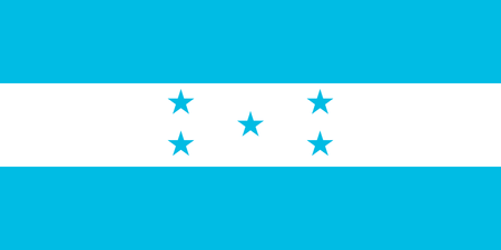
Honduras just changed their flag a few days ago and changed the shade of the blue to celebrate their new democracy! That's great! I'm sure this new blue will scare off all of the corrupt anti-democracy politicians!
Actually, I do really like this new shade, the other one was too dark and similar to the others. The stars in the middle represent their position in the middle among the other Central American countries. That's nice that they thought about their neighbors :D
If only those neighbors could also have creative flags...
El Salvador
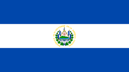
The country's name means The Saviour, but unfortunately they have not been saved from bad flag design. I only like this flag when I see it far away and don't notice the details, or when I see it from close up and can actually appreciate the details as a banner. But not as a flag, because a flag is not supposed to be either of those! The fact that I have to filter out the main symbol to like it is probably not a good thing. Redesign please. The colors in the middle are nice, why not make them better?
Nicaragua
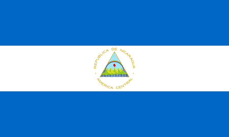
Why did the same image come again? It's barely different, and is somehow worse. I don't mind El Salvador compared to this. The font, the shade, and even the logo are more boring. At least it is one of the only two flags with purple or violet, so... a bit unique?
Costa Rica

Looks like a candy wrapper, but it's nice. The color proportions are unique so it looks cool. I was going to make a joke about them hating Thailand, but Thailand's flag is newer so it wouldn't make sense ;-;
Anyway, at least it looks good even without the seal. If they want to be unique, they can simplify the seal and put it in the middle not weirdly off center like the current seal version of the flag
Panama
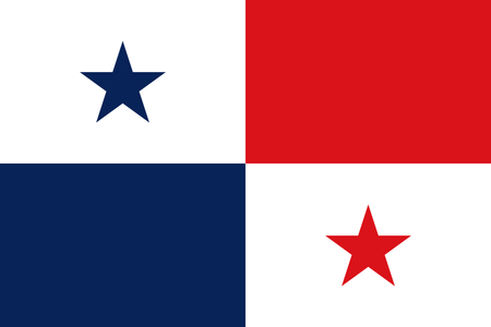
Did you know that the colors represent the political parties? Good for them that they can do that, US would explode in a second if they put political symbolism on the flag. Anyway, looks nice, definitely unique. Also kind of reminds me of the shape of the country for some reason lol
Hope you enjoyed! I will go through the whole world breaking flag laws reviewing flags!
bye
Unique means one of a kind, so you can't modify it (most unique, a bit unique, very unique). It just doesn't make sense.