U.S. State Flags Ranked From Best to Worst

+5

I recently finished my state flags quiz. It took a lot of boring work to finish. So I rewarded myself by writing this fun article, ranking the state flags from best to worst.

Note: All rankings are completely subjective and arbitrary.
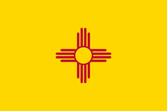
#1. New Mexico
Clean, simple, elegant, and instantly recognizable.
#2. Alaska
Each star on the flag represents one of Alaska's 8 citizens.
#3. Maryland
I have no idea what's going on with this flag but it somehow manages to be awesome.
#4. South Carolina
A simple and beautiful design from the Palmetto state.
#5. Oklahoma
A beautiful flag that represents Oklahoma's native American heritage.
#6. Arizona
Comrades unite! Together under our glorious emperor we will rule all nations!
#7. Colorado
#8 Mississippi
Much better than the flag it replaced.
#9. Wyoming
In addition to having by far the best license plate, Wyoming has a pretty solid state flag as well.
#10. Michigan
This flag's motto states "If you seek a pleasant peninsula, look about you". An apt description of Detroit.
#11. California
This bear looks a little lethargic. In fairness its is a pretty honest depiction of bears.
#12. South Dakota
#13. Nevada
#14. Kansas
#15. New York
#16. Washington
#17. Vermont
#18. Wisconsin
#19. Montana
#20. Kentucky
Kentucky: The state where fur trappers and businessmen live in harmony
#21. Louisiana
#22. New Jersey
Inspired by the Headless Horseman, New Jersey's flag features a bodyless horse.
#23. Illinois
We have now arrived at the screamin' eagle contigent.
#24. Utah
#25. North Dakota
#26. Iowa
#27. New Hampshire
#28. Arkansas
#29. Indiana
Would be enhanced with a brighter shade of yellow
#30. Delaware
#31. Idaho
#32. Maine
#33. Minnesota
#34. Missouri
#35. North Carolina
#36. Nebraska
#37. Massachusetts
#38. Florida
#39. Virginia
I like the sentiment, but the choice of apparel seems strange. Also, what is that mysterious gray object?
#40. West Virginia
I can't decide if the yellow garland is shaped like sausages, macaroni noodles, or intestines.
#41. Tennessee
One of these stars is a third wheel.
#42. Texas
Blatantly plagiarized from Chile.
#43. Connecticut
This flag looks a little too English for my taste.
#44. Alabama
In the words of Lynyrd Skynyrd, "a simple kind of flag".
#45. Ohio
This impossible-to-fold flag has a seemingly random arrangement of stars.
#46. Oregon
Drop the Comic Sans. On the plus side, the back of the flag has a beaver on it.
#47. Rhode Island
Bold choice to go with the square-shaped flag. Also there appears to be a missing border.
#48. Pennsylvania
The classic matching colors of navy blue and black give this flag its visual appeal.
#49. Hawaii
The Union Jack is a cool flag. Putting the Union Jack on a state flag is not cool. Get your act together Hawaii.
#50. Georgia
Until 2001, the Georgia flag incorporated the flag of the Confederacy. But after public pressure, they changed it to use .... the battle flag of the Confederacy.
+3
Level 60
Jun 17, 2016
Poor Hawai'i and Mississippi. The Confederacy makes battle flag as a canton really makes it look as if it were a state in the CSA (even though it doesn't exist). And I know Hawai'i was a British colony, but why do they continue having the Union Jack is beyond me. It makes it look like it is a British Overseas Territory, which it isn't. I personally like the bear on the Californian flag. It depicts a bear that is extinct (forgot its name and I am to lazy to go look right now).
+15
Level 60
Jun 17, 2016
Also (Warning: Rant incoming), I've always found annoying that nearly every state has their seal and their name in the flag. Were the producers of these flags lazy or what? A flag is suppose to be original, not the seal and the name of your state/country/province, ect. Imagine a country having it's name and seal on its flag (though some countries do have at least the seal, but not every single country and no country has their name on their flag, as far as I remember), that would be horrible and unoriginal. Also, Texas how dare you plagiarize Chile. It has also caused confusion in which the Chilean flag was used in a ballot instead of the Texan flag. Also, funny descriptions and cool list. I mostly agree with it
+10
Level 64
Jun 20, 2016
As a Texan, I don't believe Texas plagiarized Chile. I actually think it's a coincidence, and I'll tell you why. The first Texan flag, back when Texas was its own country, was approved by President Sam Houston in 1836, which showed a yellow five-pointed star in the middle of the flag with a light blue background. As you can tell, it was bad. However, this star would become the famous "Lone Star." The next flag was approved by President Lamar, which pushed the star to the left and pushed back the blue background to make room for a yellow stripe and a red stripe, in many Texans' opinions (including mine) representing peace over war (but I think it might've been to represent bravery, loyalty, and purity, or maybe it was to match the U.S.'s color scheme, for it wanted to become a state). However, the colors were not exactly the same as Chile's and still recognizable until the 1933 Flag Act which established blood red and azure blue, as well as the white star, making it close to Chile's.
+2
Level 70
Jan 14, 2017
Hawai'i's flag looks like a mess, a shame considering it is meant to represent a beautiful state with a unique history. I have to say I personally think that the flags of Canadian provinces are better than most of these flags. Most Canadian provinces and territories at least do not include a coat of arms and the name of the province itself like most of the American ones do.
+1
Level 28
Jun 5, 2021
Hawaii was not a British colony
+1
Level 40
Dec 19, 2023
Well, the Union Jack on the Hawaiian flag is there for a reason. The UK at the time didn't take over the Hawaiians. They mostly helped them, so on the state flag, they wanted to commemorate that.
+2
Level 69
Jun 20, 2016
I remember reading somewhere that Maryland flag is consisered the best flag in the world by vexillology associations.
+4
Level 82
Jun 20, 2016
Virginia is so low because QM can't spot a sword and is a little homophobic I think.
+18
Level ∞
Jun 20, 2016
Mysterious gray object, kalbahamut.
+1
Level 46
Jun 20, 2016
It's not drawn very well, but it's a sword. Specifically a "parazonium". Check Wikipedia for that.
+3
Level 89
Aug 13, 2018
Touch
+1
Level 89
Aug 13, 2018
I mean touche.
+2
Level 51
Jul 21, 2020
It is a sword, but I agree that is should be ranked that low. Looks like someone just killed somebody with a hoe
+1
Level 82
Nov 6, 2020
Have you ever killed someone with a hoe? It's not as easy as you'd think.
+6
Level 64
Jun 20, 2016
Do flags like Texas, which is pretty appealing visually, really deserve to be so low while Georgia blatantly uses the old Confederate flag ("The Stars and Bars," not General Lee's battle flag of which many, many people are familiar with).

Also, I laughed when I saw that each star on Alaska's flag represents one of its eight citizens.

+5
Level ∞
Jun 20, 2016
I didn't know that about Georgia's flag. With the new information, I lowered their rank from #30 to #49. Sorry, Georgia.
+3
Level 60
Jun 20, 2016
One question, do you not like the Confederacy? It seems like you're very biased to flags containing something visual that contains the Confederacy flag and it's battle flag (or in short Mississippi and Georgia). If you want to know what every flag means you could watch this video
+12
Level ∞
Jun 20, 2016
Georgia is a great place. Certainly, there are many things they could put on their flag. To choose a symbol of their state's rebellion against the U.S. (a rebellion whose aims were in large part to preserve the institution of slavery) seems terrible. The flag has a certain visual appeal. I don't like what it stands for. Georgia can do better.
+2
Level 82
Jun 20, 2016
Every year my family would drive to Florida. When it started to smell like a toilet we knew we were in Georgia.
+13
Level 51
May 9, 2017
Oh, kalbahamut, you must have misunderstood. We're insulting the flag of Georgia, not Georgia itself. Now quit being a jerk to the South.
+1
Level 89
Aug 15, 2018
With all the modern re-re-re-re-re-re-reinventing of the Confederate flag, sorry, but it's still a very cool looking flag. General Lee in his tailored gray cavalry uniform with the Confederate flag just looks better in a painting against the Union blues and the Stars and Stripes. Maybe they were like the Third Reich years later: despotic fashionistas.
+3
Level 56
Apr 2, 2020
Georgia can just put a Coca-Cola logo on their flag. Or Home Depot. Or Delta Airlines.
+2
Level 51
Apr 13, 2021
@Gamer1162, I don't think anybody likes the confederacy...
+2
Level 59
May 7, 2023
Lots do for dumb reasons
+1
Level 72
Dec 20, 2023
I think you mixed up the battle flag (think Dukes of Hazzard or what we normally think of the confederate flag) with the official flag (what Georgia now has) in your comment on the Georgia flag.
+2
Level 93
Jul 4, 2016
We moved to Arizona a few years ago and like the state's flag. However, until we read your interpretation, we didn't realize the deep significance of the design. Thank you, comrade, for setting us on the correct road.
+1
Level 22
Jul 26, 2016
I have enough trouble drawing the Union Jack when I have to. Ukraine have it easy. But some of these states....
+7
Level 49
Jan 13, 2017
I think they're cheese doodles.
+1
Level 44
May 19, 2017
Happy to see my home state at #14.
+1
Level 35
Jun 2, 2017
ikr
+1
Level 35
Jun 2, 2017
How does the Maryland flag appeal to you? To me it looks like someone was forcing a child to draw something impossible.
+1
Level 75
Sep 16, 2017
I don't understand how you can complain about the Union Jack on Hawaii's flag while lauding Maryland's flag. It's a beautiful flag, but IMO putting an English nobleman's symbols of heraldry on a state flag isn't cool either. You can't get much more English than the family crests of Lord Baltimore's Calvert and Crossland families, coats of arms which were granted to them by an English king.
+6
Level 71
Apr 19, 2018
The problem is that the Union Jack is a globally accepted symbol of a British territory. It's confusing for people seeing the flag for the first time. No one is confused about the Maryland flag.
+2
Level 32
Nov 16, 2017
Opinion based blog, and yeah. :P
+1
Level 32
Nov 16, 2017
hey make a list of the states themselves ranked in order, ex 1. blah because blah blah blah etc
+4
Level 59
Nov 19, 2020
That would offend almost every American on JetPunk, and there's a lot of Americans on JetPunk.
+2
Level 71
Apr 19, 2018
After looking through the comments, it seems that only me and one other person are the only ones who have a distaste for Maryland's flag. I find this surprising because I hate pretty much everything about it. 1, Checkerboard patterns don't look good on a flag. 2, why are the checkerboards slanted? 3, the red and white things look like they belong on a playing card. 4, there is no border in between the four quadrants, creating an unpleasant transition when scanning from one quadrant to another. 5, don't use black and yellow together unless you're making Batman's flag. I understand that a lot of people find this flag beautiful, and it did, of course, make the #3 spot. It's just my opinion. Also, sad to see Rhode Island down towards the end. It's a great design, just needs a left border and better contrasting colors. There's nothing wrong with a square flag as far as I'm concerned.
+1
Level 89
Aug 13, 2018
Rhode Island's flag looks like a homemade pennant hanging beside the broken screen door on a junky roadside knick knack tourist shop. The type where 2 people can't pass each other in between the weathered wood tables full of thoroughly unorganized crap that you dig down through and find more completely unrelated crap, unfolded clothes, broken pieces of all variety and someone's open bag of chips they didn't pay for. Welcome to Route 47 Pik 'N' Pak.
+2
Level 89
Aug 13, 2018
This is a flashback. This is the very first link I followed to JetPunk.
+2
Level 39
May 8, 2019
All hail the Republic of California! This flag is what made me think California was a country when I was 6-7.
+1
Level 78
Oct 3, 2019
Ohio at least thought outside the box when it came to flags. Nebraska, Virginia, Connecticut, Maine, Minnesota, Idaho, New Hampshire, Utah, Kentucky, Vermont, Michigan, and New York, all put the state seal on a blue background; Missouri looks like Paraguay; Kansas, Wisconsin, and Montana are so boring they had to put the state name in big, bold letters on the flag; Indiana has a random assortment of stars; North Dakota's eagle looks like it is choking on the ribbon; West Virginia has macaroni on their flag; and North Carolina took Texas's flag and put some words on it. Alabama is underrated for the simplicity but style; Louisiana is underrated for use of a pelican; New Mexico, Alaska, and Maryland are all great.
+1
Level 70
Jan 27, 2020
Arizona is the best
+1
Level 61
May 6, 2020
r.i.p my home state
+4
Level 70
Jul 12, 2020
Thank you Mississippi for finally removing one of the ugliest flags in existence
+2
Level 74
Nov 5, 2020
Honestly the design of the old flag was good if not for the cultural connotations.
+1
Level 66
Dec 5, 2022
For real. From a pure design standpoint, Mississippi would've ranked pretty high.
+2
Level 71
Nov 5, 2020
I actually rather like this new flag for Mississippi! Don't have a lot to compliment the state on, but at least they have one thing I can appreciate now.
+2
Level 14
Oct 28, 2021
The new flag is awful, completely boring and generic and unidentifiable from other flags. You only like it because of the flag it replaced.
+1
Level 59
May 7, 2023
How so? Every other flag is a seal on blue.
+1
Level 51
Jul 21, 2020
I would rather have Wyoming or Arizona in #1.
+2
Level 74
Nov 5, 2020
I would like Wyoming more if the seal were not branded onto the bison.
+8
Level 67
Sep 16, 2020
That's BS! The Texas flag is NOT a rip-off of Chile, and it actually looks clean, unlike all of those STUPID blue backgrounds with seal you put ahead of Texas!
+6
Level 86
Nov 5, 2020
Any flag that's just blue with the state seal on ought to have automatically dropped to the bottom (with those that are just the state seal on a different colour background above, but only as they know there are non-blue colours). Even if Texas' flag is plagiarized, it's still a flag rather than a seal put on a bit of cloth, and so superior.
+1
Level 78
Nov 5, 2020
I agree that it does look better than the blue flags with the state seal are worse than Texas. That does not, however, mean that Texas did not rip-off Chile's flag.
+1
Level 79
Nov 5, 2020
The Georgian flag actually seems pretty cool.
+13
Level 89
Nov 5, 2020
Wow. Mississippi jumped from #50 all the way to #8. Way to go, Mississippi!

... Never expected I'd be saying that in my lifetime.

+2
Level 14
Oct 28, 2021
The new flag of Mississippi sucks and you only like it because of the flag it replaced.
+1
Level 59
May 7, 2023
You said this earlier. The old flag is literally Confederate. You wish to keep flying racist banners of a failed rebellion.
+2
Level 83
Nov 5, 2020
When I see Arkansas I always think it could be a logo on a sauce bottle, probably some spicy one.
+1
Level 74
Nov 5, 2020
I'd buy it
+2
Level 74
Nov 5, 2020
In my opinion the worst flags are those of Massachusetts and Illinois because of their lack of contrast on white pages and to a bright sky. I actually really like the flag of Tennessee because the stars are ordered in this weird way.
+1
Level 74
Nov 5, 2020
The horse's head on New Jersey's flag was a design offer from Vito Corleone. New Jersey couldn't resist.
+1
Level 74
Nov 5, 2020
Aw come on, you gotta give Georgia credit for defacing the battle flag with this weird building and the gamechanging phrase "In God We Trust". That makes it much better. In fact I can't even recognise that it used to be the battle flag.
+1
Level 86
Nov 5, 2020
I'm surprised you didn't go with the joke that, here in New Jersey, if you're not careful, the horse's head could end up in your bed.
+1
Level 72
Nov 5, 2020
Most of these flags have pretty much the same concept and design. Only the unique ones like New Mexico, Wyoming and California are the cool ones. Also Mississippi's got a lot better.
+1
Level 78
Nov 5, 2020
New Mexico, Maryland, Alaska, Mississippi, and Ohio are the best flags. Ohio, Tennessee, and Hawaii get points for uniqueness. The states with the crest on a blue background are boring.
+1
Level 14
Oct 28, 2021
Mississippi’s new flag is absolutely bad and generic. You literally only think it’s better because of the flag it replaced. If that previous flag never existed you would say that the new flag is bad as well.
+2
Level 71
Nov 5, 2020
In my opinion, this is too state-centric.
+4
Level 58
Nov 5, 2020
Low key annoyed that Ohio is so low on this - at least it's a unique design instead of another blue flag with a seal in the middle. Also I don't know why we're complaining about Texas having a design similar to the Chilean flag... half of Europe uses similar designs to one another so it's not exactly unprecedented.

Love the new Mississippi flag though.

+1
Level 78
Nov 5, 2020
It seems like half of the states have flags that are so similar and mundane that they had to place the state name in big letters on it to let people know which state it belongs to. Also, Texas plagiarized Chile and North Carolina plagiarized Texas. Ohio is still underrated for being unique.
+1
Level 14
Oct 28, 2021
The new Mississippi flag is garbage and generic literally I can’t tell it apart from flags like Kentucky and Pennsylvania the only reason why you even like the Mississippi flag is because of the flag it replaced. If that previous flag never existed you would say that it was bad as well. You probably think the current flag of South Africa is a good flag as well simply because of the flag it replaced even though that flag predated Apartheid by 20 years
+1
Level 60
Jan 5, 2023
If you can't tell Mississippi's flag apart from Pennsylvania, you might have to change your contrast settings.

Select the Start button, and then select Settings > Accessibility > Contrast themes. To turn on contrast themes, select the theme you want from the Contrast themes drop-down menu, and then select the Apply button. Windows may display a “Please wait” screen for a few seconds, after which the colors on the screen change.

+1
Level 51
Nov 20, 2020
I don't really like Mississippi's new flag.
+1
Level 51
Nov 20, 2020
Ohio and Tennessee's are much better.
+1
Level 51
Dec 3, 2020
Ohio has 17 stars because it was the 17th state I think.
+1
Level 51
Dec 16, 2020
oof for people from the state of Georgia i'm from Maryland glad we got 3 place but why does no one know what's going on around and about in the flag it's clearly a sign of uniqueness ;)
+2
Level 47
Feb 3, 2021
What's wrong with Alabama's flag? I personally like the simplicity of it.
+1
Level 68
Apr 9, 2021
It uses the confederate battle flag, which definitely has negative connotations.
+2
Level 14
Oct 28, 2021
It literally doesn’t though. The flag it’s based on is the Cross of Burgundy which was the flag of the Spanish Empire that controlled Florida and a part of Alabama at one point. Nothing about the flag references the Confederacy.
+2
Level 61
Mar 21, 2021
I think Rhode Island is missing the border to look like it is "attached" to the flagpole
+1
Level 52
Apr 10, 2021
You seem to have made a mistake in the Georgia review. It originally had the battle flag, and it now has the national flag, not the other way around.
+1
Level 49
May 18, 2021
Maryland's flag is complicated as hell. Also, that was the flag of the Kingdom of Hawaii used to establish good diplomatic relations with the UK and the USA before the latter oh so kindly annexed it. Knowing this helps you appreciate how insensitive the "get your act together" comment is.
+3
Level 65
Jul 29, 2021
There's a Mitsubishi in Tennessee Flag
+1
Level 14
Oct 28, 2021
You can tell that the creator of this article has political biases and other biases simply by how he ranks the flags. Mississippi’s new flag is absolutely horrible and completely generic, and can be easily confused with Kentucky’s flag or Virginia’s flag or many other flags, but because of the flag it replaced he ranked it high, and Ohio’s flag ranked low all because “it needs to be folded a lot”. You can also tell that he’s historically illiterate because he didn’t even know what the actual Confederate flag was until someone told him. I find it ironic though because he probably would rank South Africa and Zimbabwe’s flags high on national flags lists simply because “they’re unique and the flags they replaced” even though they have heavy political symbols in it.
+2
Level 43
Dec 8, 2022
How in the hell can Mississippi's flag be confused with Kentucky's or Virginia's?
+1
Level 60
Jan 5, 2023
A survey by the Youtuber "Vexillographer" created a survey named "VADFOES" where every flag would be rated out of 5. In the United States, New Mexico ranked first with 4.364 points, Mississippi ranked 11th with 3.562 points, and Wisconsin ranked last with 0.513 points. Full results here: https://docs.google.com/spreadsheets/d/1IRW-MK-vFHgba5lp1H_JVyKSJPYnzwAgeixD4Xh3wEQ/edit#gid=0

Overall, considering flags like Idaho's and Wisconsin's are extremely generic and rank last on most US state flag quizzes, Mississippi's is one of the better ones.

+1
Level 71
Apr 29, 2023
Buff ideas:

Oregon: remove the front

Nevada: use white for snowfall and yellow for the desert

Montana: use a mountain

Wyoming: remove the seal

Nebraska: use a cornhusker

Oklahoma: remove the name

South Dakota: use Mount Rushmore

Illinois: simplify the flag

Indiana: improve the contrast, remove the name

New York: use the Niagara falls or the silhouette of the Statue of Liberty

+1
Level 45
Aug 16, 2023
Need to update this now that Utah has a new flag
+2
Level 63
Dec 16, 2023
Reminds me of this video. Also, Utah and Minnesota now have new flags, I'd like to see how they change the standings