Astana's Charts
A pineapple jack-o-lantern.

Views on each quiz in the Country of the Day series.


This shows the languages that have the most total pages on Wikipedia.

These are my most-taken quizzes on JetPunk.

These are the likes on interviews from Interview of a JetPunker. This only includes regular interviews, and not the Last Questions blogs.
This is a summary of how many users have at least 1 point in each featured language. As of February 19, 2024.
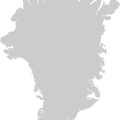
This chart shows the change in Greenland's Carbon emissions over the years.

This chart shows the relative sizes of some of the tallest skyscrapers in the world.
This chart shows how much property costs per square foot in each American state. Also check out the median price for homes as a whole that I made!
Ever wonder how the takes of different users compare? Take a look at this. As of December 21, 2023, this chart shows the total takes of the top users.

In the past month, a few users have posted blogs on the RUB. Here is a brief breakdown of the blogs posted by each user.

Ever wonder where in the United States it is cheapest or most expensive to live? Take a look at the comparison of median home prices around the country.

This chart shows the population of nations that are at the top of the population list.
Copyright H Brothers Inc, 2008–2024
Contact Us | Go To Top | View Mobile Site