Featured Quizzes
User Quizzes
Create Quiz
Data and Charts
Badges and Games
About JetPunk
JetPunk Shop
Random Quiz
Dark Mode
Former Flags
Name the countries, current and former, that once used these flags.
In some cases, it was not the only flag in use
Rate:
Featured Quiz
Last updated: March 15, 2018
You have not attempted this quiz yet.
More quiz info >>
| First submitted | March 14, 2018 |
| Times taken | 70,504 |
| Average score | 68.8% |
| Rating | 4.96 |
4:00
Enter answer here
0
/ 16 guessed
Time Used
00:00
Best Time
00:00
The quiz is paused. You have remaining.
Scoring
You scored / = %
This beats or equals
% of test takers
also scored 100%
The average score is
Your high score is
Your fastest time is
Keep scrolling down for answers and more stats ...
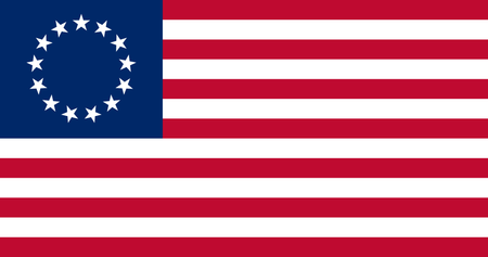
(1777–1795)
(1211–?)
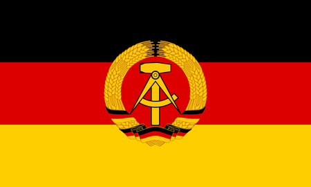
(1959–1990)
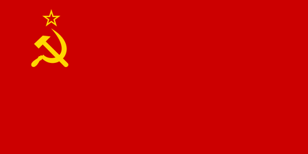
(1923–1991)
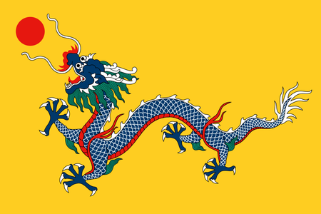
(1889–1912)
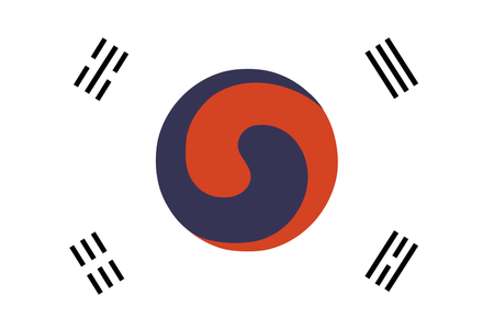
(1868–1921)
(1971–1972)
(1882–1910)
(1928–1994)
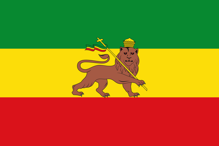
(1941–1974)
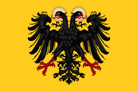
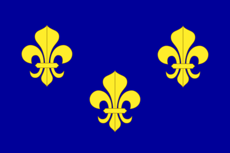
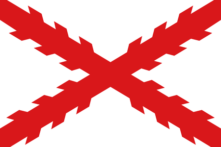
(1430–1806)
(1855–1893)
(1496–?)
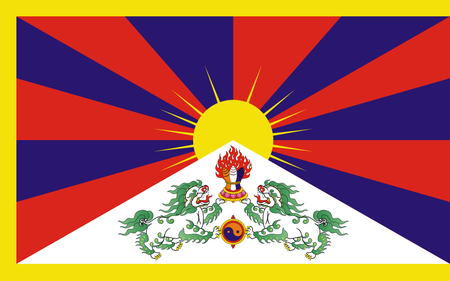
(1916–1951)
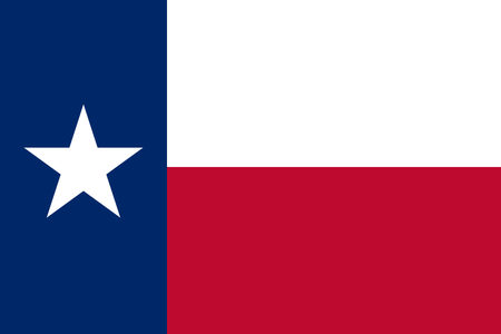
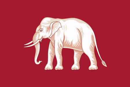
(1836–1846)

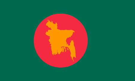
(1977–2011)
New and Popular
Save Your Progress
Copyright H Brothers Inc, 2008–2024
Contact Us | Go To Top | View Desktop Site
Most of these flags are better than now.
"We need ideas for our flag"
"GREEN"
"Perfect!"
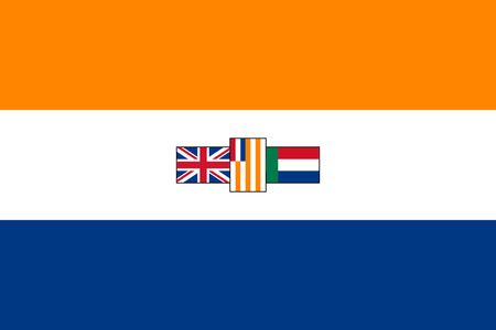
1. Rips off the flags of the UK and the Netherlands while having absolutely nothing symbolic of South Africa itself.
2. Flags should not, I repeat SHOULD NOT, have other flags on them. It literally makes no sense whatsoever.
3. The way the flag-on-flags are organized is also unpleasant. Why is them on its side? Why are they all clustered so close together? Even if they were spaced apart a bit I could maybe forgive, but like that? Nope!
4. Ugly color scheme.
No, I am very happy with South Africa's current flag. Let's hope we neither see this flag, or the apartheid system, return to South Africa any time.
|||||||||||
|
| |
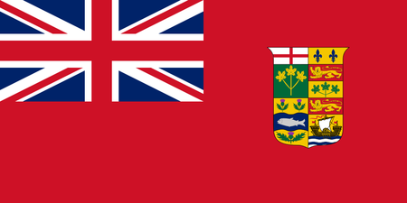
It seems there was a lack of standardization before 1922. The Canadian Red Ensign with the coat of arms would fly until 1957, when they put a white circle around the coat of arms. And then in 1965, they ditched the whole thing and brought in the now-familiar Maple Leaf Flag.