
What makes a Picture a Good Picture?
First published: Friday February 17th, 2023
Report this blog
Introduction
Most of us own a really good camera, the camera on your phone, even if we aren't photographers. Maybe you played a bit with it and took some pictures on vacations for example. And when you go through the pictures you took, you might have thought: "Oh that looks really good!". But do you also know why?
Photographers are constantly aiming to take pictures, that looks good in the eyes of everyone. But how do they know, what everyone likes? What is it, that makes a picture look good?
I'm a hobby photographer and I fell in love with the art of photography 7 years ago. I'm by far not professional and there is a lot of room to improve for me, but in this blog, I will show you the world of photography, using my own pictures.
The Golden Rule
Some say it's just photoshop, but that's not true! If the picture is bad, you can be the most skilled person in photoshop, but the picture will still look bad. So the first step is to take a good picture, in order to have a good base for editing. And there is simply a Golden Rule every photographer follows.
It's called the Rule of Thirds.
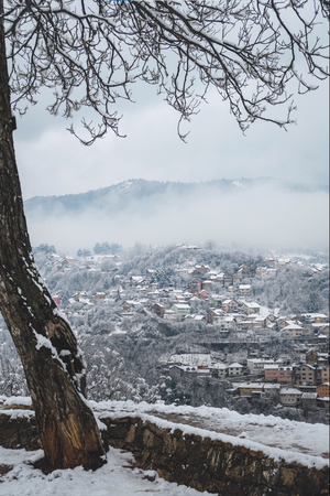
It's the easiest compositional rule to follow. What it basically means: Don't put the object in the middle of the picture. Here is an example:
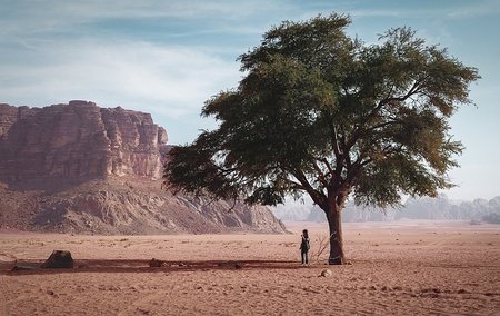
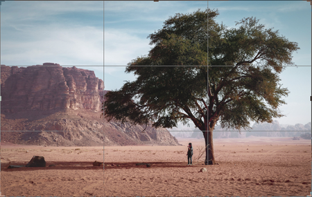
I taught my father how to take pictures and he did it well here. He applied the rule of thirds. The tree is not in the middle of the picture, it's on the right third. Even on your phone camera, you probably have the option to turn on a grid. The grid is supposed to help you finding the third and might look like this.
Easy right? But does it mean I can never put something in the center?
No.
There are other compositional techniques that makes a picture look more interesting. The easiest technique you can use, where you can have the object in the middle, is the "Frame".
Frame Composition
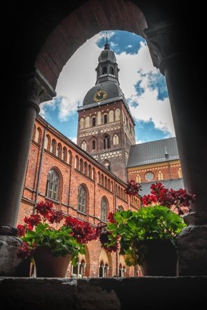
Even though I'm not the biggest fan of this picture, it explains the composition. The arch is framing in the main object, the church tower. Not only that, the flowers and the arch are on the foreground, making it look more 3 dimensional. The reason I don't like this picture so much is because the frame is not symmetrical. (Also the colors and the picture itself is not so interesting to me.)
Often times when we take a picture, we instinctively take a picture of the beautiful thing we see right now. But things that look good in our eyes, doesn't necessarily look good in a picture. It is often worth looking at your surroundings to find something to create a composition for your image, like a frame or a foreground or object in general. Let me show you an example.
Although admittedly this picture isn't that bad, it misses a point to look at. So I was looking around and tried to figure out how I could make this scenary a bit more interesting. And this is what I found.
I simply applied the framing technique using a tree. Even though there is still no direct object the tree is framing, it has now a foreground and looks more like a "scenary" as if you're standing there. Maybe a person standing or sitting under the tree might have improved the picture, but I believe the background is interesting enough to justify the "emptiness". It also now creates some emotion to the place and maybe tells a story. What I like about this picture is the shape of the tree. It reminds me of some old japanese paintings like this one:
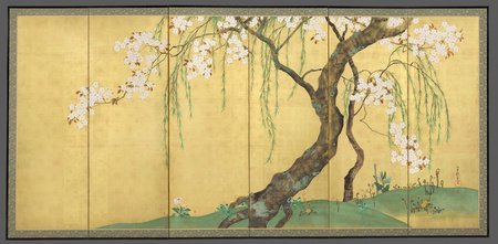
This painting has an amazing composition. It is all it needs to make a single tree look beautiful.
Speaking of Japan, I could not resist to use this picture as an example of the framing technique.
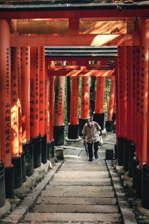
In this case although, I think it is hard to avoid the framing technique.
Color Composition
Not only is the arrangement of objects important, but also the color. It shouldn't bother you too much when you take the picture, because often times you can change the color in the editing process. But how do you decide, which colors you pick?
I will now show you one of the first pictures I edited, with a very bad color composition.
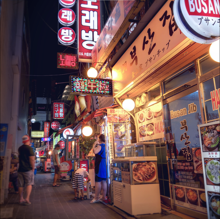
Honestly, everything is bad in this picture. There is no object to look at and too many things are going on here, so are the colors. There are orange lights, red signs, blue dress and some magenta shadows and overall too colorful. These colors don't go well together.
To make things simple, I would recommend to not use more than 3 colors in a picture. In fact, you should rather focus on using only 1 or 2 colors. What do I mean by that? Here are some examples:
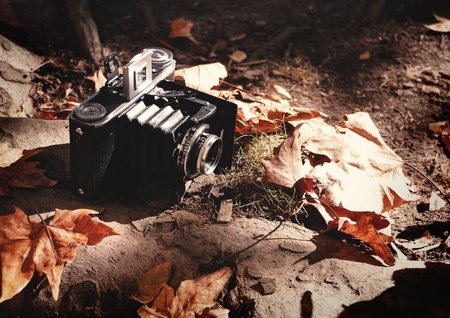
Here I used 1 color: brown. Even with one color, you can have many different shades and contrasts. It is also fitting for the autumn scene. Notice that I removed the green color of the grass right in front of the camera, to make this picture monochromatic.
In this case it is not so unnatural to remove the greenness of the grass, but what if there are many more things going on, like a blue sky? Well you can also go crazy like that.
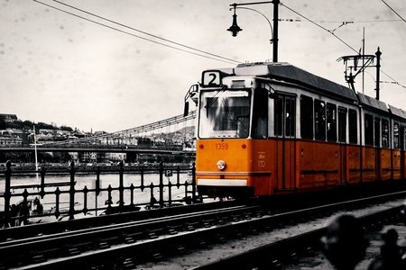
You can say this is a desperate solution but it makes the picture look better. The problem is just that it looks like a mainstream picture as the yellow taxi cab in black and white New York, or a red double deck bus in London. I'm sure you've seen such picture once. Let me show you another example.
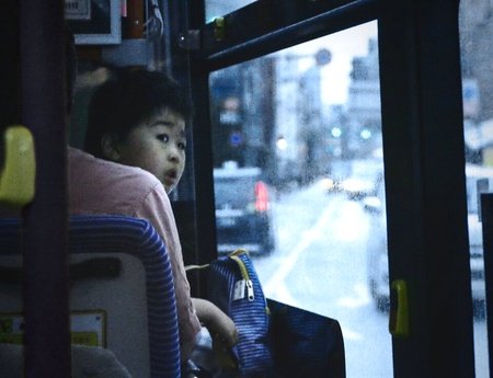
Yes I sometimes dare to take a picture of a stranger. A facial expression automatically tells a story, in this case you might wonder what the kid is looking at. Looking back at something that has passed. Together with the rain and the mostly blue atmosphere, it creates a sad mood to the scene.
I remember uploading this picture and realized my terrible mistake.
Can you spot it?
This is how I should have done:
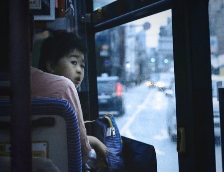
The yellow stop button was distracting and not contributing to the monochromatic color scheme. Yes I left a bit of other colors in the picture, but blue is still the dominant color. Using one color is probably the easiest way of making a picture look good. But what if you wanted 2 colors? This is how you do it:
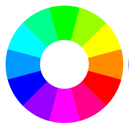
A very common way to use 2 colors are using complementary colors.
What does it mean?
It simply means to take the opposite color from the color wheel. Here is an example:
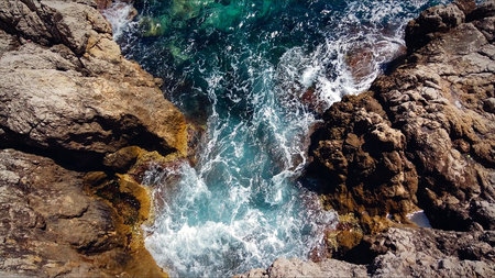
Here we have a teal and orange composition. A very common composition, especially because the sky can often be shifted to a teal color. In this example tho, we have the ocean as teal and the orange / brown rocks.
In theory, you're supposed to use the opposite color, but it is not a strict rule that you always have to apply. The most important thing is that the picture looks natural. As long as you don't combine blue with magenta or red and yellow, you should be fine. This is an example where the colors are on the edge of being complementary.
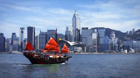
Here I can't shift the red ship to orange. It wouldn't look natural and not as dramatic as red. By the way, do you still remember the Golden Rule? This is also applied here, as you can see.
If you happen to have a picture with just blue or magenta or red and yellow, don't worry. You can often argue with either trying to make it monochromatic or adding a third color (Can even be white or black!) This is an example:
Here we have the problem of having many colors between yellow and red. But in this case, the "color" black is also pretty dominant as well as white. And you might be able to argue that it is a monochromatic picture.
In the end, these composition rules are just a help of orientation and rules can be broken. In my opinion, this is the beauty of art.
Conclusion
Yes, there is of course much more to photography, but in my eyes, these are the basics for every picture to make it look at least decent. You might be inspired now to take pictures, but think that your phone camera is not good enough. In fact, 3 of the pictures I used in this blog are taken with my cheap Samsung / Huawei smartphone at least 5 years ago. It just shows that compositions are much more important than the equipment you have. (And I hope you didn't dislike my phone pictures)
If you're a photographer reading this, critique is always welcomed.
And if not, I hope I could inspire you to a new art form, that allows you to express yourself in more than thousand words each picture.
Thank you for reading.
also thx for breaking the atmosphere we were havingedited to add.....Your pictures are great regardless of the equipment.
When I was in collège and then in lycée, I used to take part in some photography "lessons", but I sadly stopped it with higher studies. I would love to learn more about photography thanks to your blogs, and I'm already very happy to have read this one.
I wish you an excellent continuation!