Reviewing (and Roasting) US City Flags (and vote for the JP flag!)
Last updated: Monday June 19th, 2023
Report this blog
US city flags are world-infamous for being so lazy, so let's review all of the major ones (over 500K population). I'll also leave the link to vote for the JetPunk flag at the end!
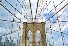
New York
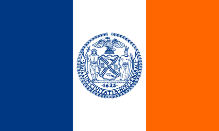
"Mom, can we have Netherlands?"
"We have Netherlands at home."
That's basically this flag. I'd suggest a complete redesign, since there's so much NYC is known for, other than being Dutch for a while.
Los Angeles
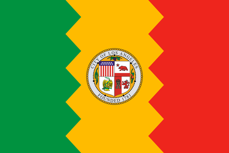
Is LA an African country? The pattern and symbolism is actually quite good, so it can be improved with a better symbol and some other tweaks.
Chicago
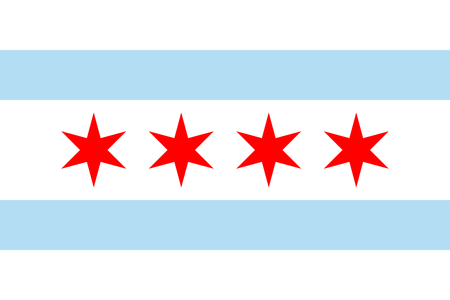
I always thought Chicago was the most typical American city, so it's quite un-American of them to have a good flag. No improvements, it's a great and simple flag.
Houston
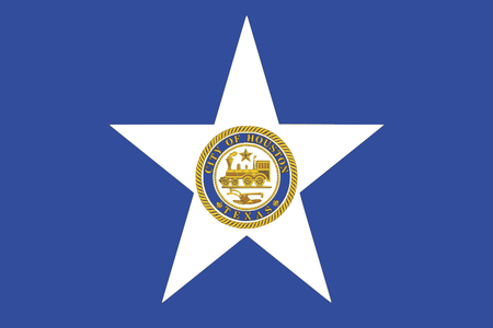
Somalia colonized by a choo-choo train? The star is a good symbol, but you can use it more creatively...
Phoenix
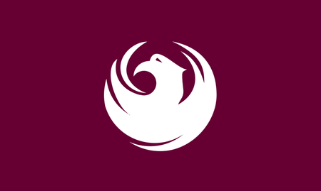
WOW! Thank you Phoenix! That's all! Amazing! Japanese-inspired flags are great, we need more of those.
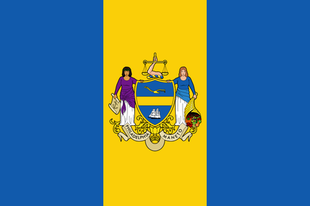
Philadelphia
"Mom, can we have Sweden?"
"We have Sweden at home."
Not even the Liberty Bell? That's the only thing everyone knows about the city! Also, whose arm is carrying the scale in the middle of the flag?
San Antonio
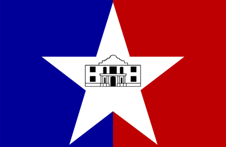
This looks like something a kid who just got into vexillology would draw. It looks fine and the idea is good, but it seems to be executed a bit sub-par.
San Diego
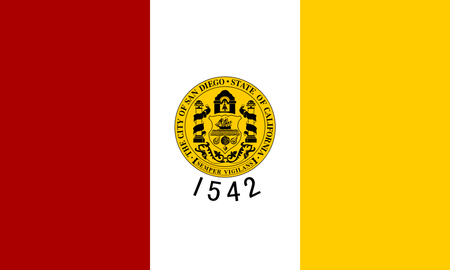
Wow, I knew San Diego has many attractions and sites, but I didn't know they were founded in 1542! Now I want to visit there even more! What an amazing symbol, now I will immediately remember San Diego when I hear 1542!!! sarcasm
The color scheme is unique so that's a start I guess. I'd also expect blue as it's probably most well known for it's coast. And the white clashes with yellow so I'd remove it.
Dallas
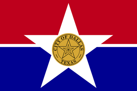
Here we have a star made up of 10 irregular triangles, located in a star inside a dotted circle inside a real circle inside a star on a line. Is this shapes class?? Without the seal it's uncreative, but at least it looks nice...
San Jose
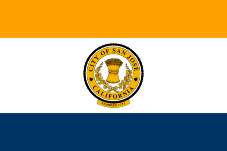
This looks a bit more pleasant than the others for some reason, but it still has a seal. SJ is known for being the center of the silicon valley, so why not replace the seal with some symbol of technology like uh... a gear? A lightning bolt? Something like that.
Austin
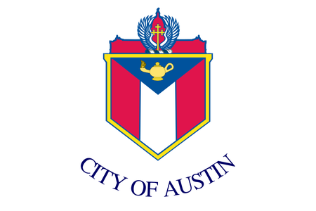
Puerto Rico got Alladin's lamp to ask the genie if it can become a state. But it's turned vertical and it's on Austin's flag for some reason. They even had to remind us in all caps. I don't even know where to go from here...
Jacksonville
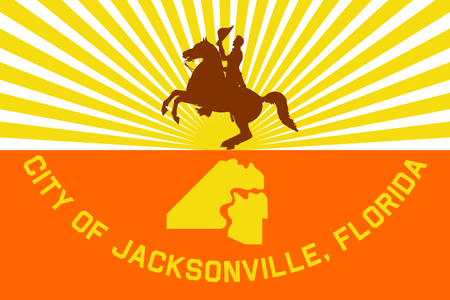
I don't need to make a joke, the flag is a joke. It looks funny but it's seriously the flag? Also, Florida is probably the state least associated with cowboys and horses.
Fort Worth
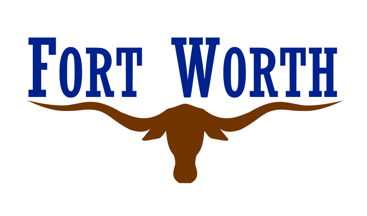
Let's appreciate the bull holding up the letters, if not for him, it would be Ort Wort. I feel sorry that he has to waste his time holding up letters instead of being a cool symbol in a proper flag.
Columbus
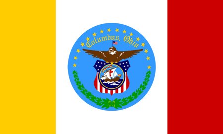
Why is there an eagle flying an American flag holding an American flag-shield which has a picture of a boat with a Spanish flag on it? Also the colors are Spanish ohh that explains san diego's color scheme too, at least it makes sense there
Columbus wasn't even Spanish, and Spain never controlled this area, why do they care so much about Spain??
Indianapolis
Charlotte
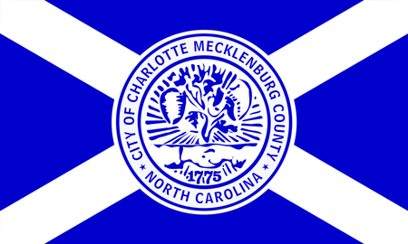
Mom, can we have Scotland - Okay, this joke is getting old... And what's even going on in that seal?
San Francisco
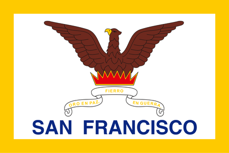
Wow, I'm disappointed. That "phoenix" looks like a pigeon wearing a costume designed by a 5-year-old. And that fire... you can think of your own roasts, I can't decide which one to use. And thanks for reminding us that this is SAN FRANCISCO, I almost forgot that this school-play poster is supposed to represent a world-famous city. Also that sheet or whatever that quote is written on (which is a dumb quote anyway, it means "Gold in peace, Silver in war", what is that supposed to mean, am I supposed to get inspired by that or something??), anyway, that sheet looks horrible on the background.
Seattle
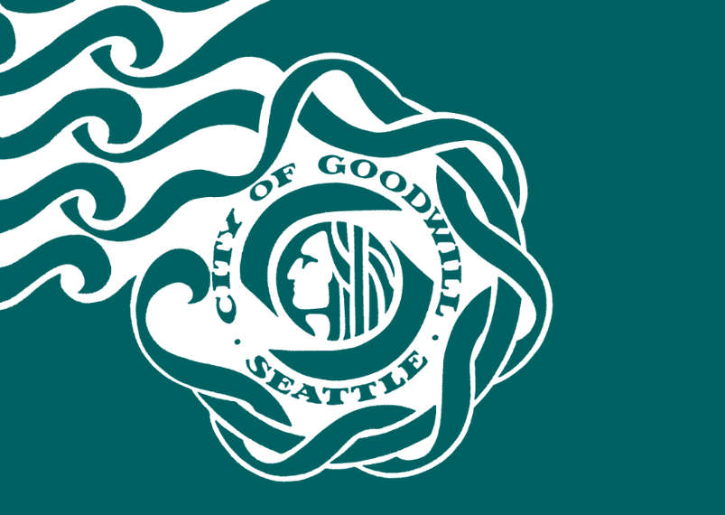
Seattle, the capital of the JetPunk empire, Well, it's interesting. It's definitely unique and I love the color. The waves just look weird coming out of the top-left. Chief Siah'l is a great symbol, along with the waves, it has so much potential, but it's not used well.
Denver
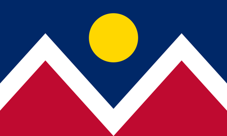
Incredible. It just looks so nice overall. It represents nature as well as the indigenous heritage with the patterns, which is an amazing combination.
Washington
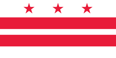
This is based on the Washington family coat of arms, which is interesting, but seems strange to represent a whole city with it. At least it looks nice.
Nashville
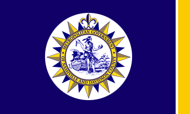
They even bothered to shade it? It's just a sun design, it doesn't have to be so complicated. Speaking of complicated, what's even happening inside?
Oklahoma City
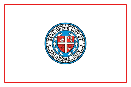
If you had a blank slate, why would you draw everything in one place and leave the rest? Why? Why? Why? Why would you do that? Why does the seal need to be so complex anyway? Why is there an atom? Why does this image exist?
El Paso
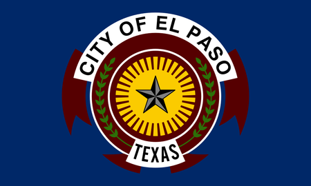
At first this looked nice, but it's not good. Why is there a star on top of the sun? The sun is a star! And the sun's rays don't look like that. Assuming that's even a sun. And that name tag looks interesting, but I don't think it's needed here. It's a pretty strange flag.
Boston
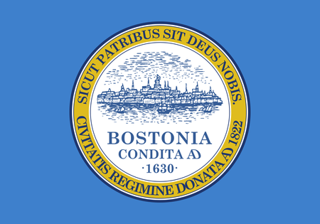
"Nice flag!"
"No, that's my painting"
"Yeah, I know you painted a flag"
"What? It's not a flag!"
"Oh, I get what you're saying, it can't be a flag!"
"Exactly, it's a painting!"
"It needs some Latin text!"
"What???"
If you don't want to make a flag, you don't have to... the Quadruple Alliance won't show up at your door and arrest you if you're not a vexillographer. Don't force yourself and end up with this.
Portland
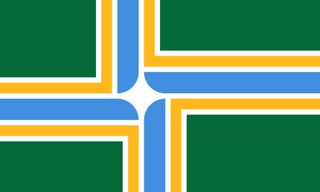
Riveting. This is how to make a flag unique. It has an interesting, modern design, and represents the city's nature.
Las Vegas
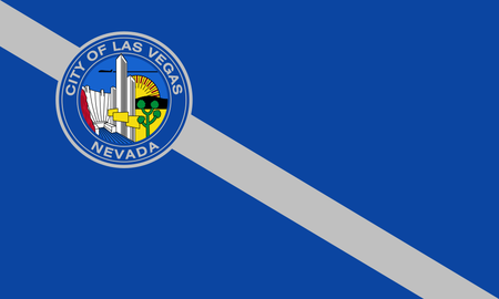
You can't turn a boring background into a flag by putting a tiny stamp picture on it... That image looks like a cartoon, is that plane an alien trying to destroy the sun? Why is that cactus weird? Are those yellow things billboards?
Detroit
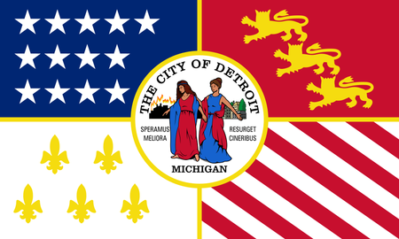
Are those ladies giving us a tour of the flag? Why is the city burning on one side? Outside of the seal it's okay, but not that great.
Louisville

American cities are more proud of France than France is! It's also drawn in a strange style.
Baltimore
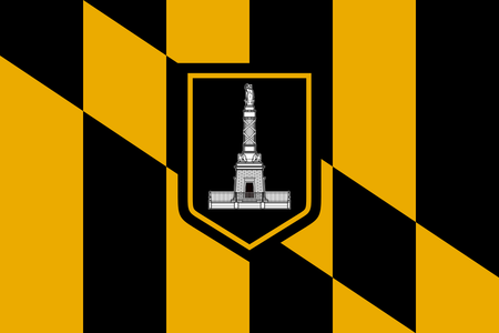
Cool, I like the color scheme.
Milwaukee
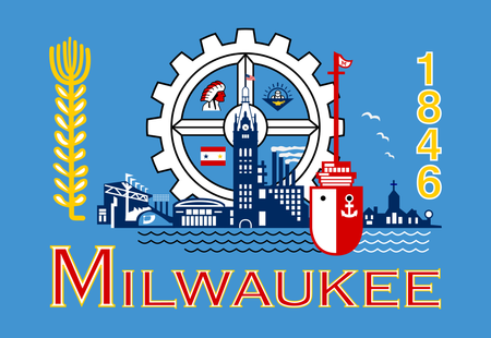
No. That's all. I will not waste my time on this.
Albequerque
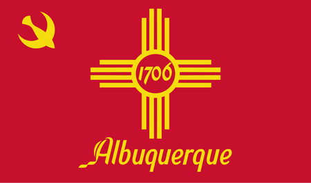
THE COMMUNISTS ARE COMING!!
No seriously, this is basically communist New Mexico. Except we know that it's still America because they have to put the name and the date... Thanks for teaching us the spelling! ironically i misspelled it, i'll just keep that as a joke
Tucson
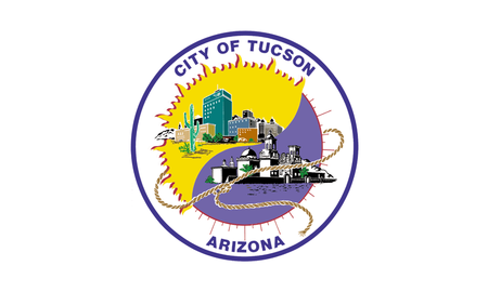
Is that a Yin-Yang? Why are there so many buildings? Why is there a knotted thread? I don't understand anything...
Phoenicians, please liberate your Tucsonian compatriots...
Fresno
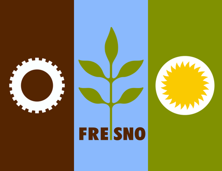
I like it, but not as a flag. This should be a logo. It would be great if they sticked to one of those symbols, but together it doesn't work.
Sacramento
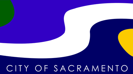
Looks like a screen saver, and the colors and shapes are taken from a lava lamp. Did they really have to stick those green and yellow shapes into the corners?
Kansas City
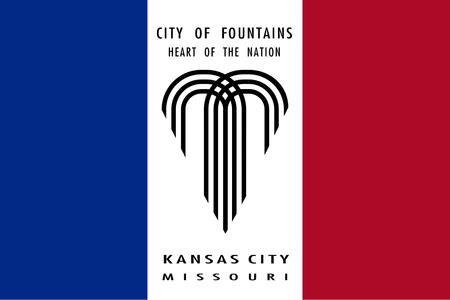
Who replace the white on France's flag with a newspaper advertisement for Kansas City? At least they reminded us that it's in Missouri. I also think it's clever what they did with the fountain being heart-shaped, but why didn't they make a unique flag based on that? This has potential.
Mesa
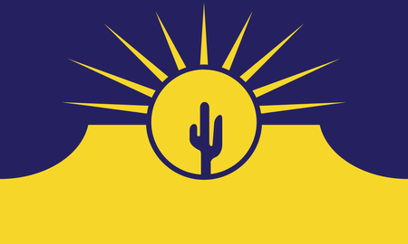
This flag is not only an amazing design on it's own, but is also a lesson for all those complex-seal flags. This flag shows three famous symbols, the mesas of the region, the sun, and the cactus, in to one graphic along with a pleasant color scheme. Instead of showing different symbols in a picture, combine them in one graphic.
So, those are my opinions on those flags. Hope you enjoyed my jokes, and let me know if I should do something like this for some other flags. I have lots of ideas for flag blogs lol
And here is the voting form for the JetPunk flag! May the best flag win!
For the glory of JetPunk!!!
Here's some more stuff to check out :)
byy
Russian city flags are better!Russian Flags
EDIT: and another i found:
More Russian Flags
And the flag of Ufa is definitely nice from a vexillological point of view but not Pskov's. And those links are not working.
I should probably add them to my provisional list of weird flags for the second part of WUFAWmaybe i can do russian flags for the second episode of RARFjapanese are even better!It's like US: AHH WE HAVE TO GET RID OF ANYTHING COMMIE
Albequerque:
(Agree with -1. That’s strange)
Lethbridge's flag is still worse than any of these, so I can't slander any of these flags (too much). Great blog!
MilwaMilwuaMilwaukee lol.The People's Flag of Milwaukee